Frank Marchese
ui / ux creative leader • digital product experience designer
e: frank@frank-marchese.com | v: 203.570.5699 | click2evolve.tumblr.com | linkedin | download resume
A proven leader, specializing in both front-end UI as well as interactive UX design and strategy. Hands-on experience designing for desktop, iOS and Android mobile applications, prototyping for web, mobile, and other digital delivery platforms. Demonstrated passion and desire to innovate and push boundaries creatively, conceptually and strategically to help drive the interactive design experience.
factset FUSION design system: vision
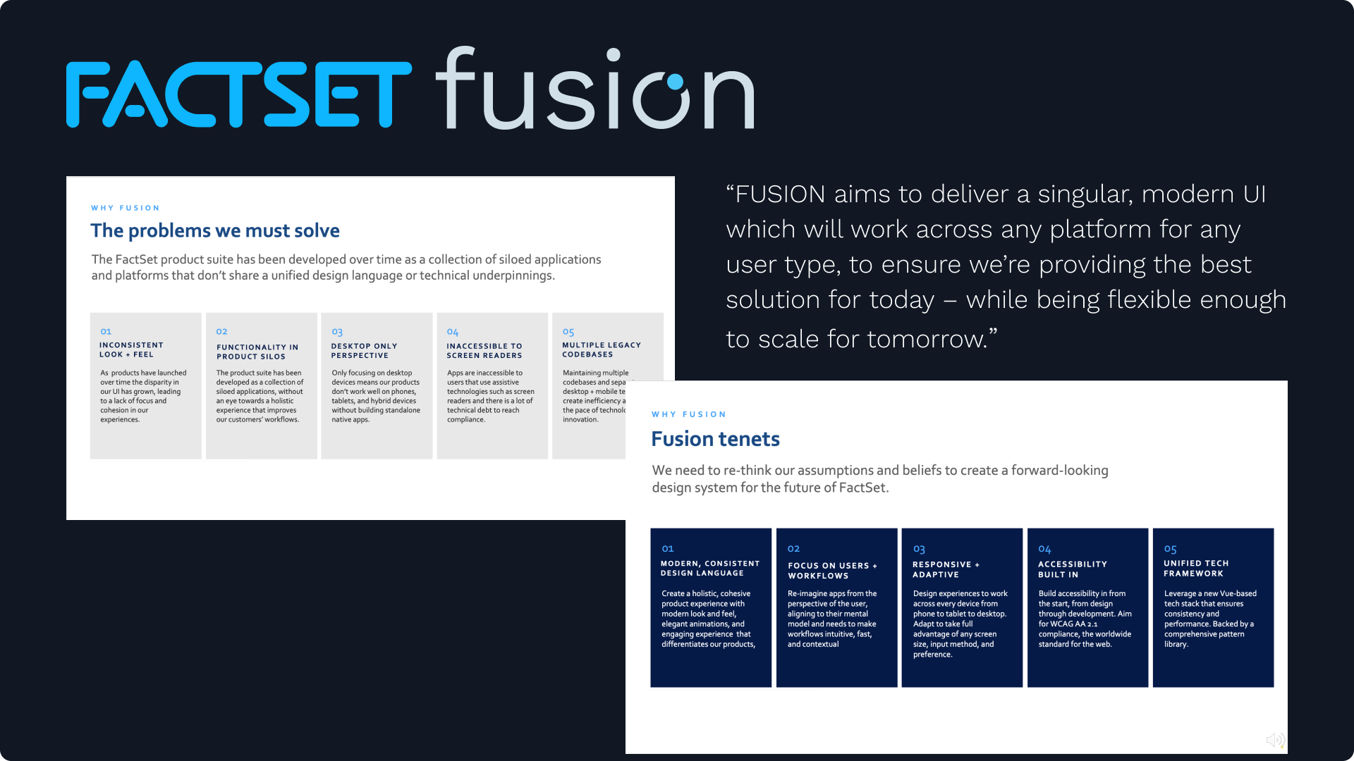
The FUSION design system aims to deliver a singular, modern UI, while reimagining our applications from a user-first perspective, and building them to be responsive, adaptive and inclusive. It's more than just a collection of components and patterns - it's a product development philosophy and a vision for the experience we want to provide for our users.
Design systems are essential for achieving scalability, efficiency, and consistency across design efforts, bringing organization to complexity. When scoped properly, the design system governs the entire design process in an organization. It establishes the vision, mission and guiding tenets and principles for which every design decision can be measured against.The FUSION design system is more than just a collection of components and patterns - it’s a philosophy for product development, and a vision for the experience we want to deliver to our users. It is a workflow based product solution.
It is equal parts “approach", “deliverable” and “result”. FUSION provides user-centric workflow solutions that are platform agnostic, leveraging responsive and adaptive modular components and patterns to provide fully accessible applications that deliver contextually relevant content when and how clients need it. And it is the product design philosophy which will propel the FactSet user experience into the future.
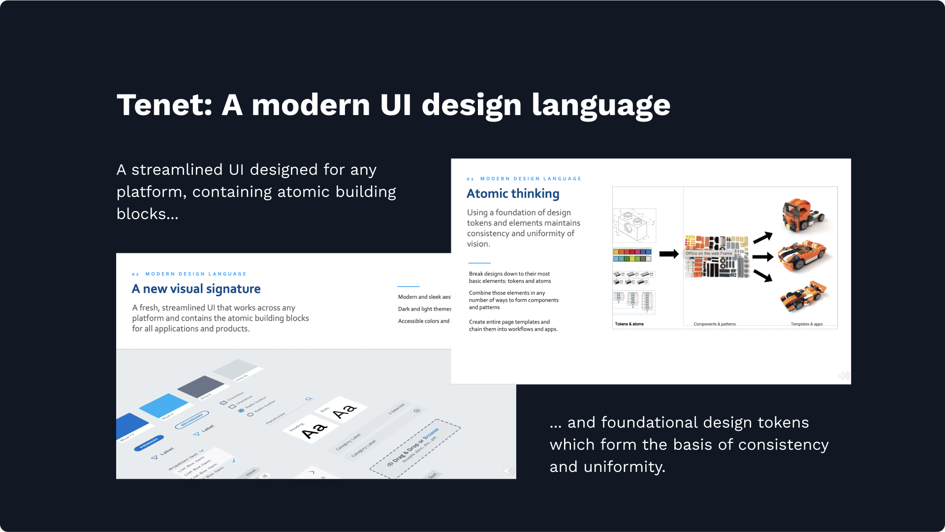
FUSION product vision Our vision is to establish FactSet as the leader in financial technology through the FUSION design system, which offers a cohesive and adaptable user interface that integrates effortlessly with user workflows. By applying principles of atomic design, progressive disclosure, and contextually relevant content, we will deliver a consistent and superior user experience across all touchpoints, ensuring that our platform is flexible, holistic, and aligned with the evolving needs of our users.The origins of this initiative can be traced back to 2017, originally conceived as an exercise in updating the products "visual signature", to modernize the UI. Working closely with key business stakeholders, my internal design team and an external creative consultant, an updated visual style guide was designed to reflect the brands key values of "speed, intelligence and trustworthiness".
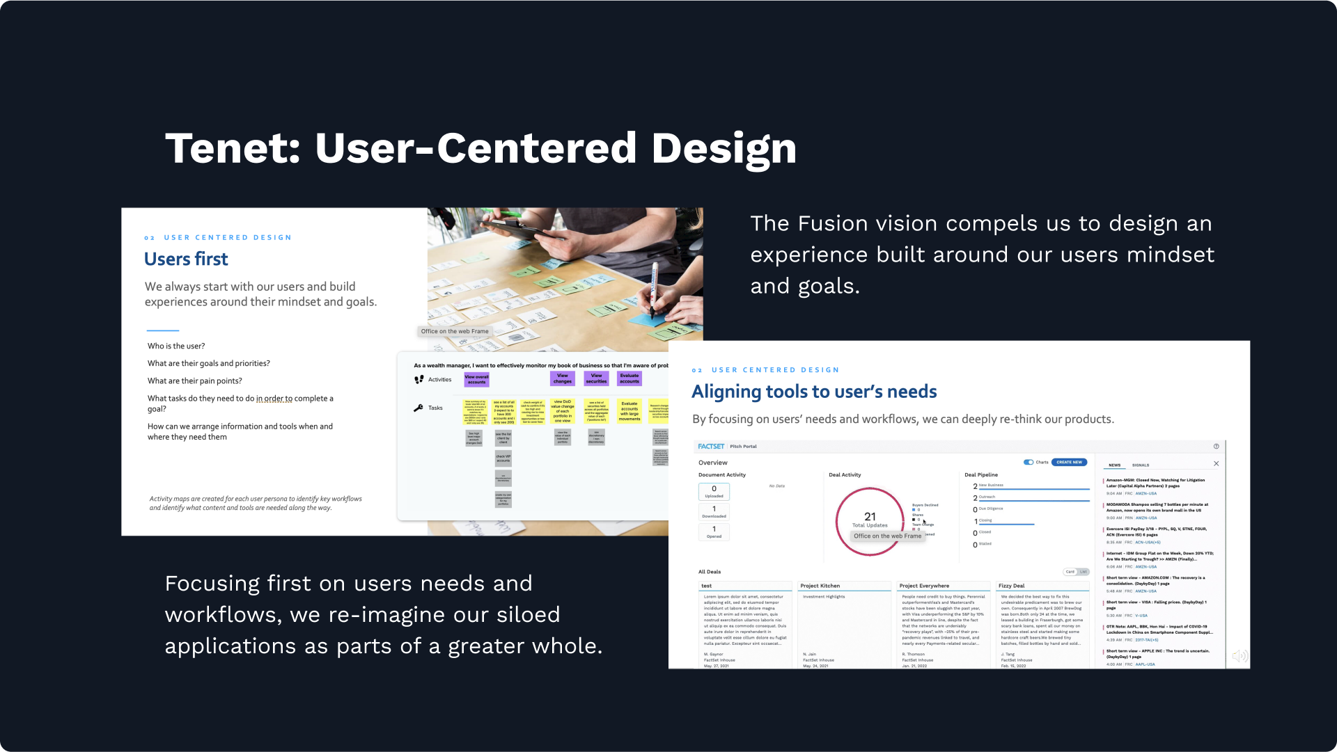
But after years of applications being developed in silos, no simple "face lift" was going to make this a better user experience. Starting with a single user type, identifying their top priorities, and designing an interface optimized for every task along their journey, the entire FactSet experience was reimagined from a user-first perspective - and a new design system was developed around it.
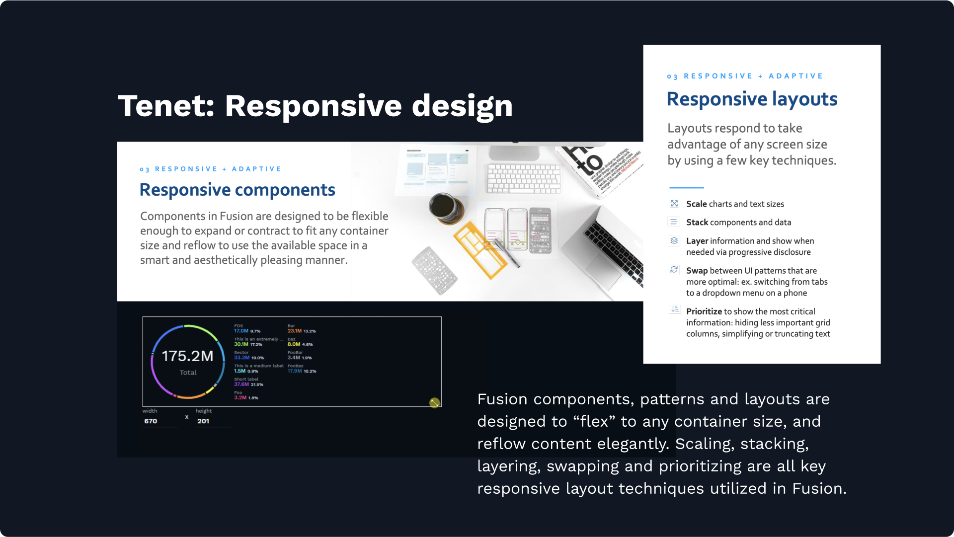
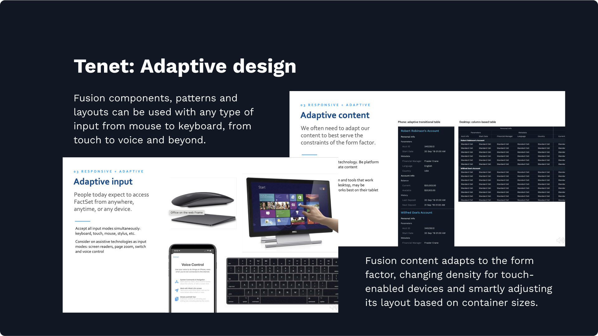
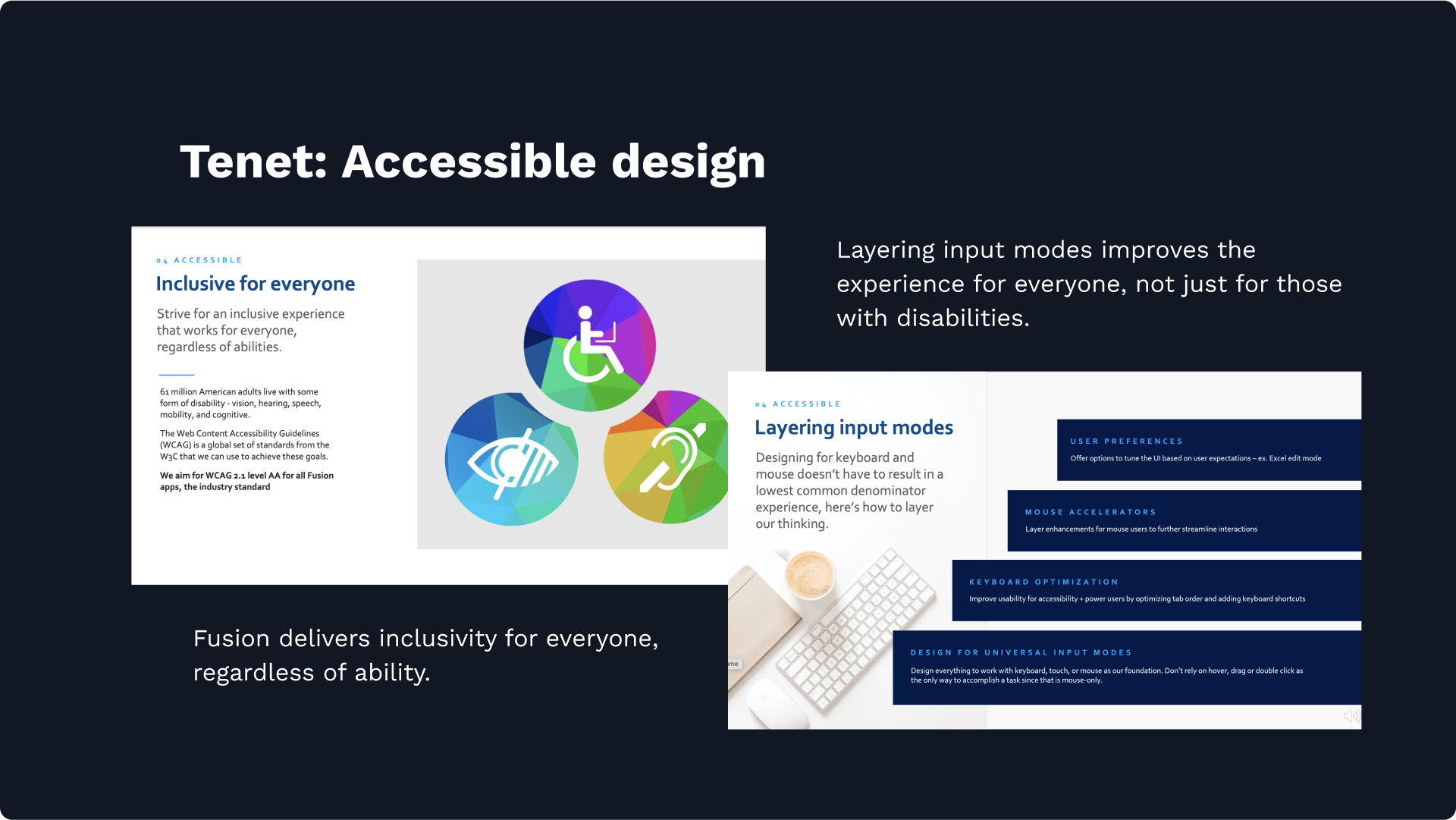
As technology advanced, the FactSet product needed to advance with it - transitioning from a desktop install to a web based application suite. Our new design system would require fully responsive components, capable of flexing and seamlessly reflowing content to fit any container size. Equally important, FUSION components need to adapt to any input, be it mouse, keyboard, touch or even voice. The FUSION design system would also offer inclusivity for everybody, regardless of limitations on their ability, by strictly adhering to WCAG AA accessibility standards.
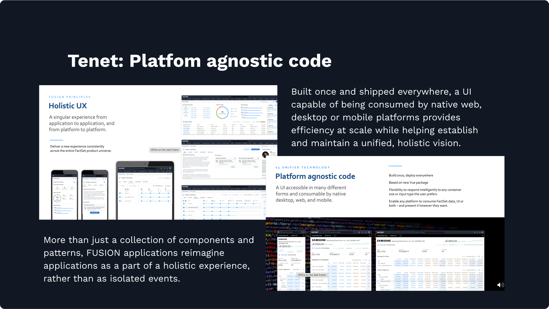
FactSet applications built with the FUSION design system will meet the user where they are, allowing them to use it any number of ways. A platform agnostic coding approach allows us to build once, and deploy anywhere. Understanding that our customer will access FactSet from any number of devices and platforms, the FUSION design system reimagines disparate FactSet offerings as part of a unified, holistic experience.
FUSION Tenets
FUSION products use a modern design language Tailor designs to our users' aesthetic preferences and tactical requirements. Atomic design methodology keeps our work consistent.
FUSION products are user first Understand who our users are, how they work, and what goals they hope to achieve. Create design patterns that connect our users' most important activities and guide users through key workflows.
FUSION products are responsive and adaptive Create interfaces that adapt to the user's needs. Optimize layouts for all screen sizes, orientations, and screen densities, designing responsive behaviors and density settings into every component.
FUSION products are accessible Build inclusive experiences, starting at the design stage. Follow WCAG AA design and code guidelines, and include AXE validation and compliance testing as part of every code deployment.
FUSION products are built on a unified technology framework Our code makes our UI deployable everywhere and our data consumable by native desktop, web, and mobile platforms.
FUSION Design Principles
Holistic UX By taking a comprehensive approach to UX, FUSION delivers consistent experiences across FactSet applications and platforms.
Declutter the UI FUSION simplifies and declutters the user interface, elevating workflows and deemphasizing everything else.
Content in context FUSION applications introduce the right content at the right time to expose key information and tools when users need them most.
Progressive disclosure FUSION provides easy access to increasing levels of detail. Rather than encourage endless scrolling, our designs display the appropriate depth of content.
Context switching FUSION makes it simple for users to start new activities, tasks, or workflows.
factset FUSION design system: component library
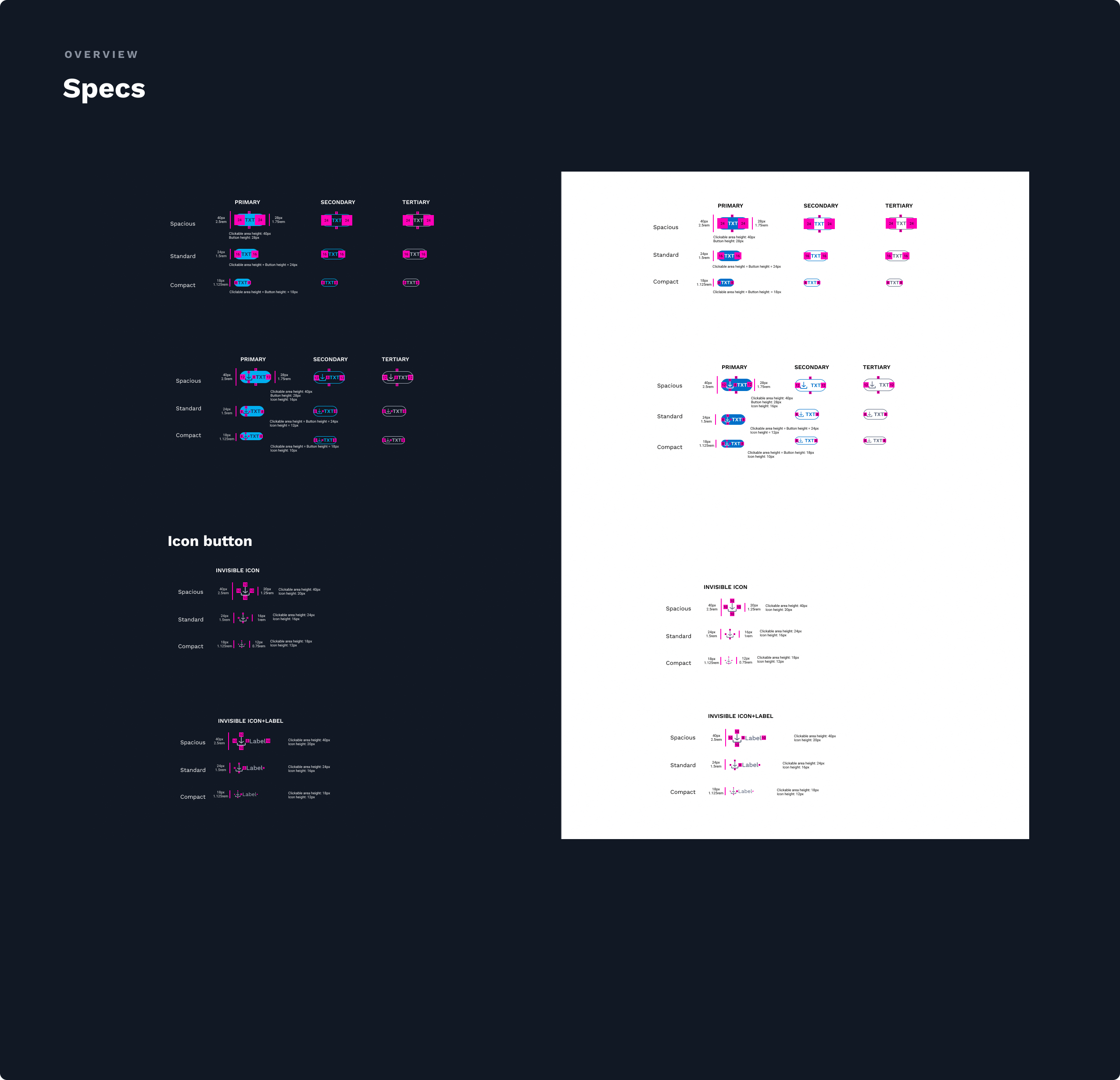
Design systems govern the design workflow within an organization. A component library plays a key role in this system, and needs a framework and set of guidelines to be truly effective. These guidelines, along with accumulated best practices, are established through the design system itself. With carefully chosen tools and strategies, a design system provides a robust infrastructure containing all the essential components and design patterns needed to develop successful products and services.
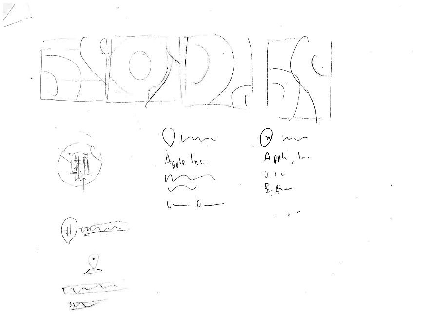
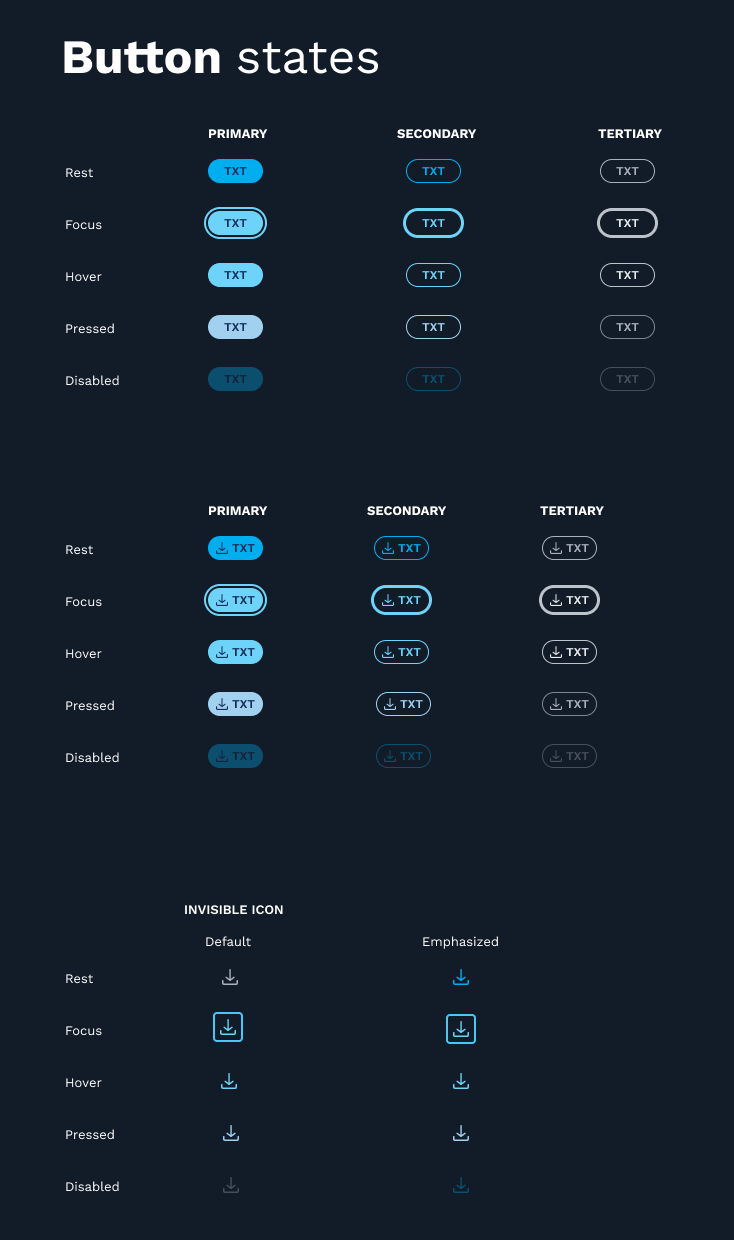
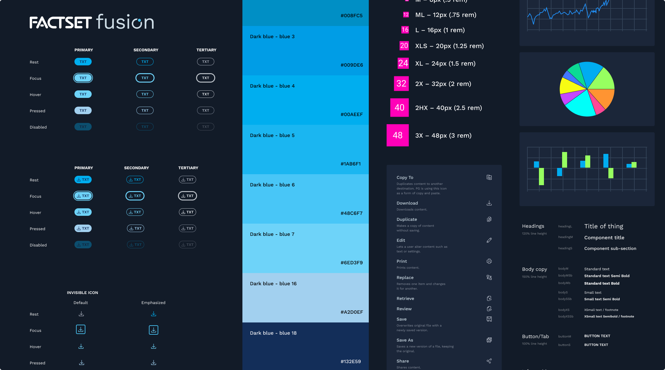
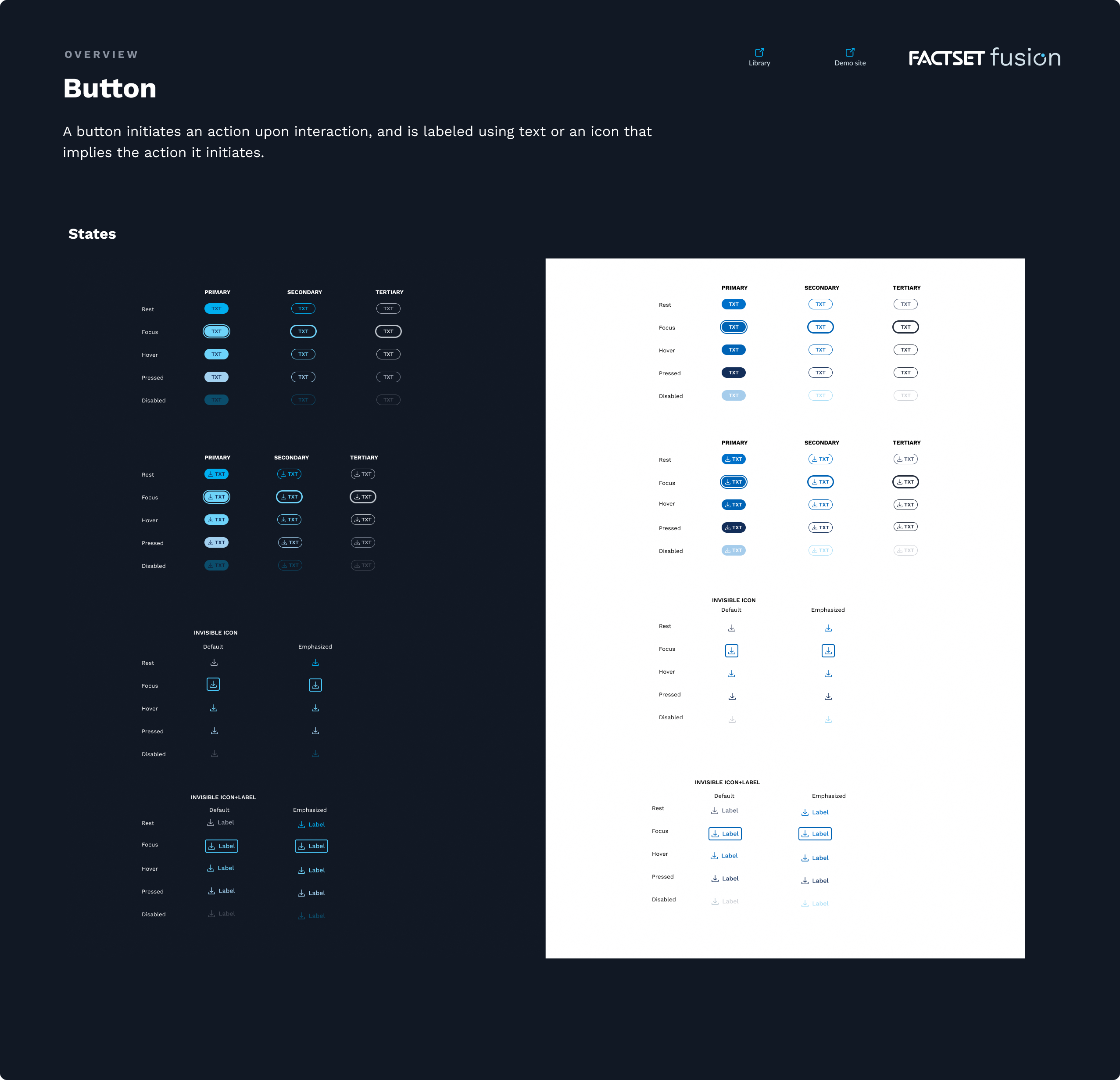
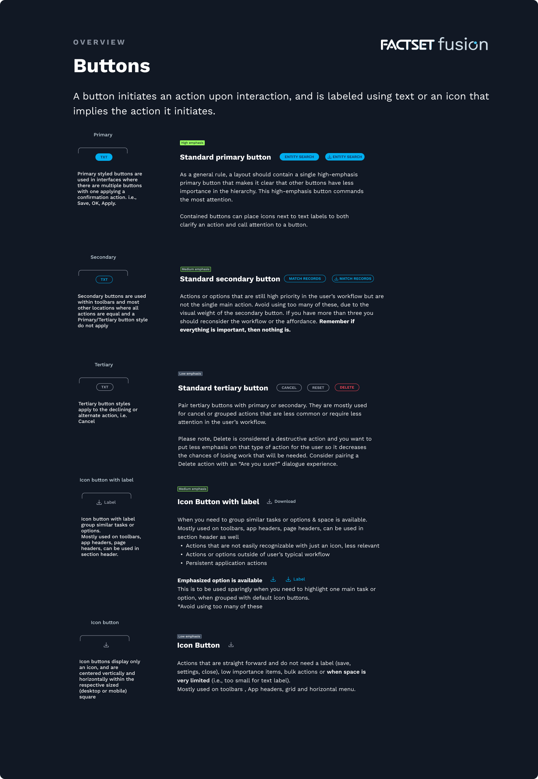
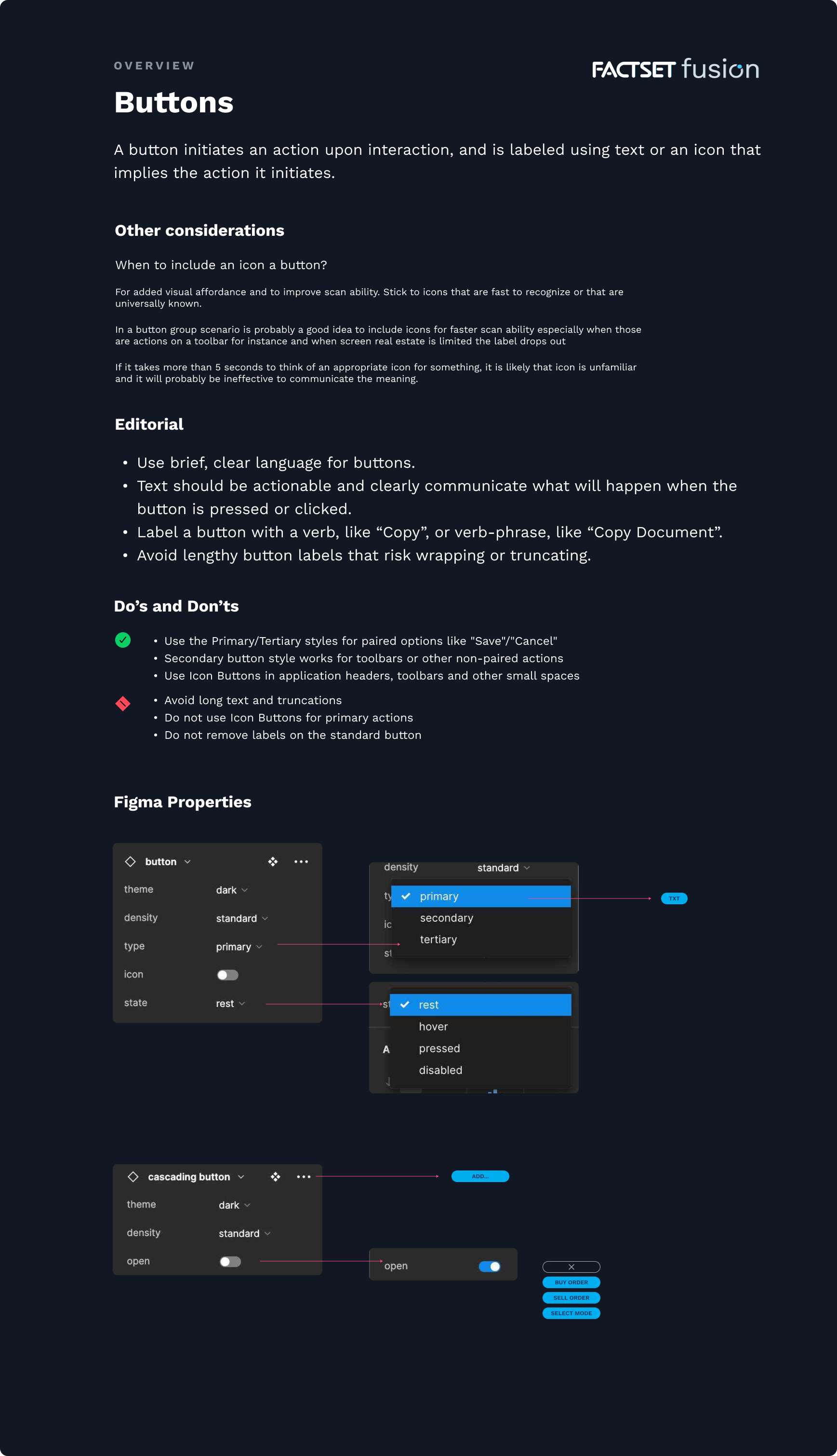
Leading a team of highly talented and knowledgeable designers, we honed and crafted the FUSION component library ... a complete set of functional components for every user interaction and scenario ... visuals of every subtype and state, in light and dark themes ... robust component and pattern usage guidelines, including UX writing, accessibility, do's and dont's ... developer specifications ... and even Figma property breakdowns, to make it simple for the UX application design team to use in their comps.The samples shown here are from the "Button" breakdowns - one component in a continuously evolving library - illustrating the effort and attention to detail which is given to every design system element.
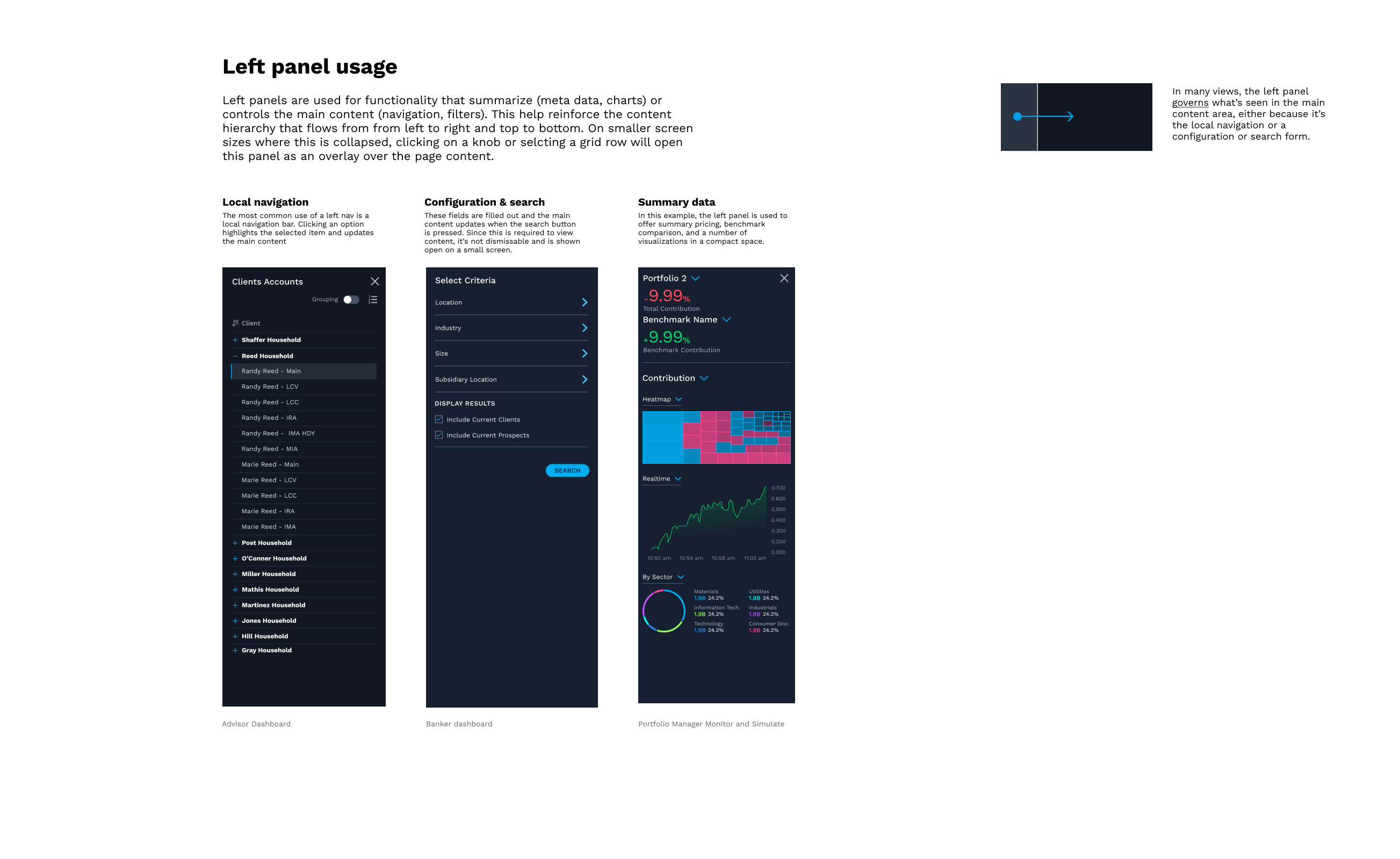
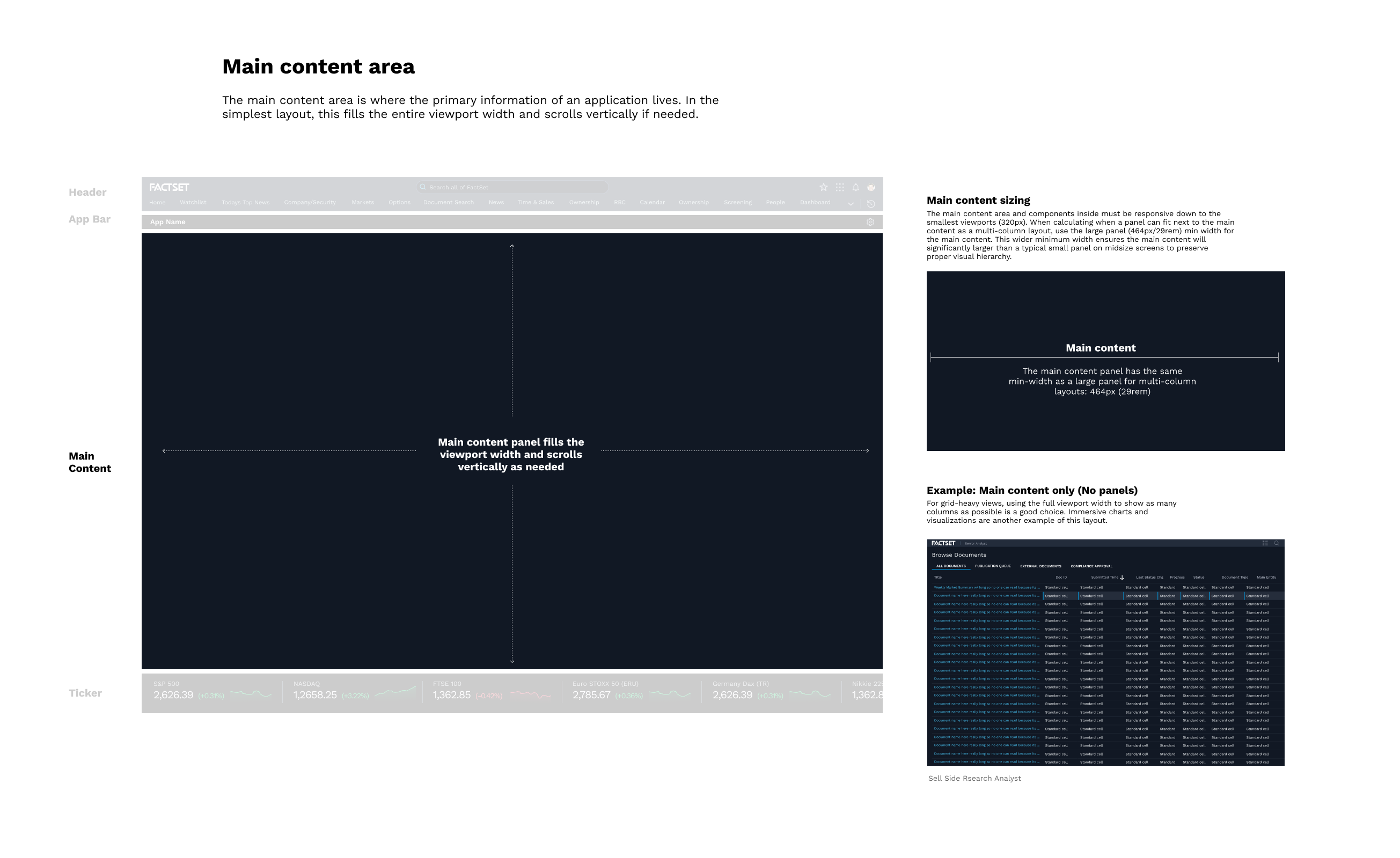
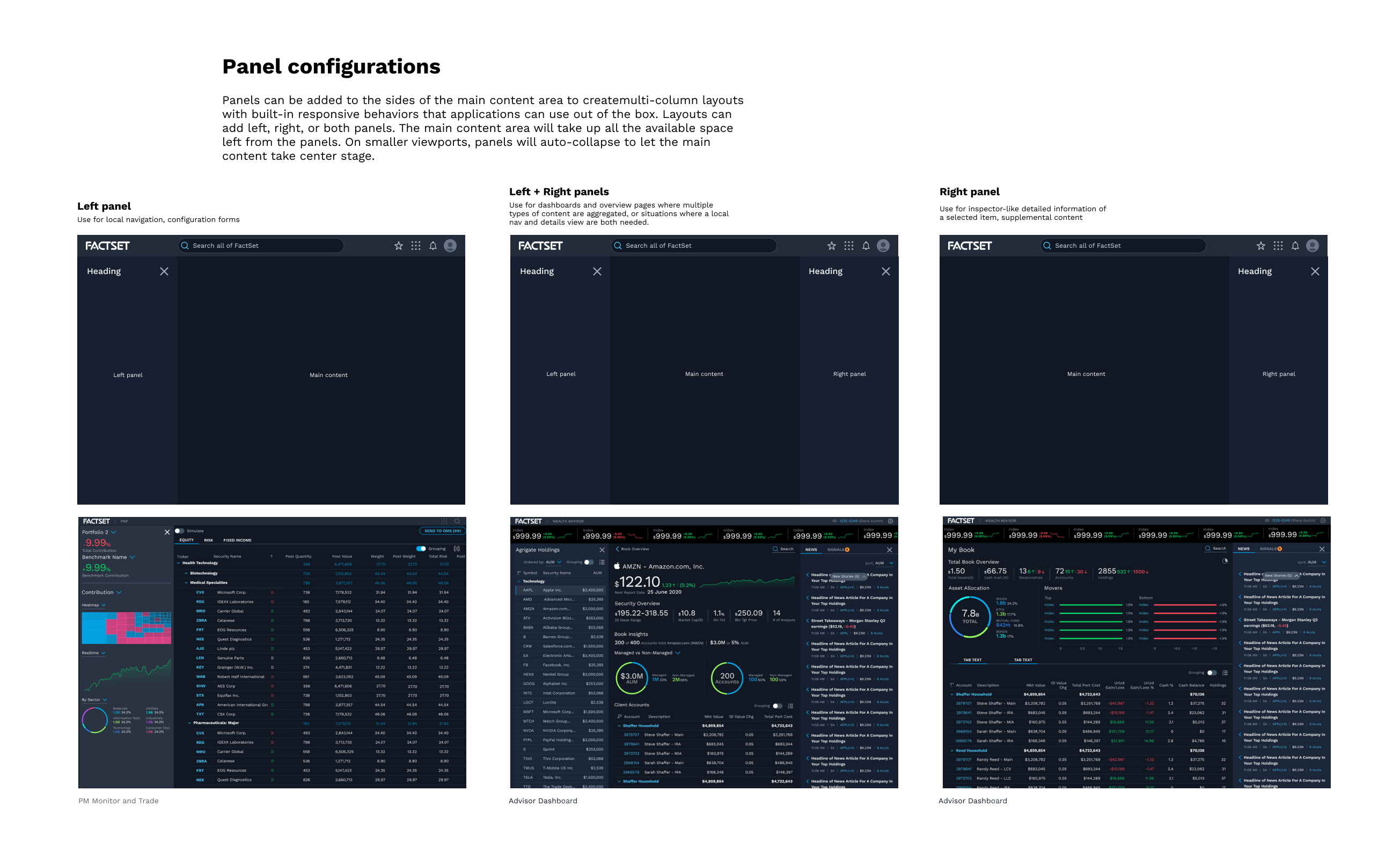
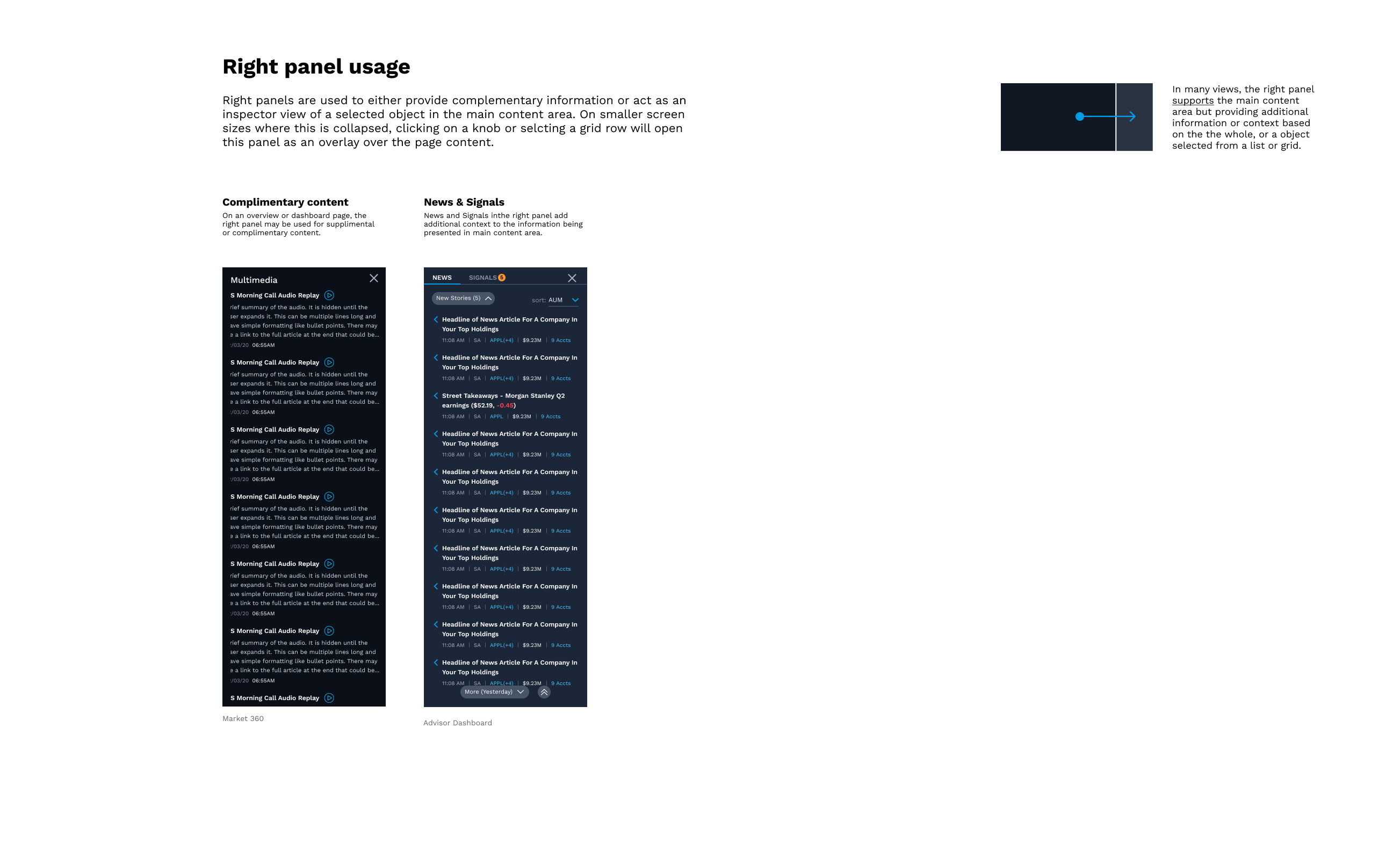
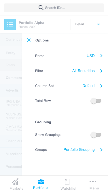
factset FUSION design system: layout system
Design systems guide the design process across an organization, providing a structured foundation which ensures consistency and usability. Incorporating a responsive, adaptive layout system is essential, as it enables products to perform seamlessly across diverse devices and screen sizes, enhancing user experience and accessibility. By integrating this flexibility, a design system becomes a comprehensive infrastructure that supports the creation of cohesive, adaptable, and high-quality products and services.
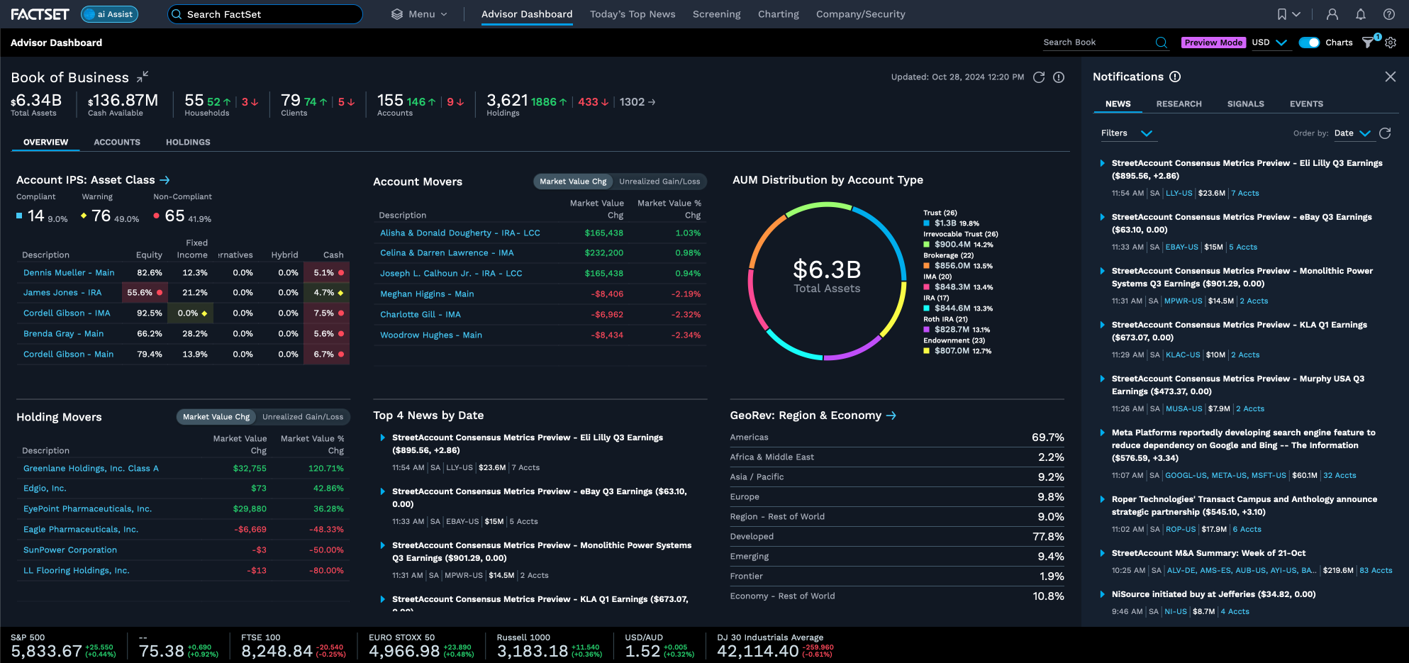
Partnering with product and subject matter experts in the Portfolio Management space, my team and I concieved, designed and architected a robust, responsive layout system modeled to compliment the portfolio managers behaviors and daily tasks. It follows the FUSION design system principles of progressive disclosure (i.e summarizing the most salient data, and then exposing more and deeper levels as the user explores) and content-in-context (i.e. surfacing important information to the user at the appropriate time related to his contextual inquiries).The samples shown here detail a basic layout template developed for the FUSION deisgn system, which many FactSet applications follow - including the succesful flagship product "Advisor Dashboard".


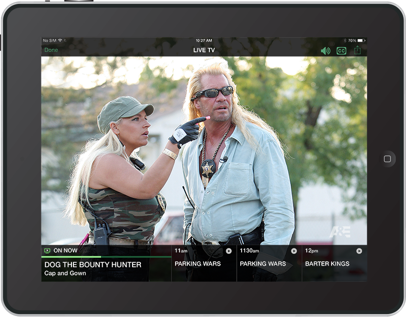
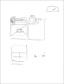
factset mobile 3.0
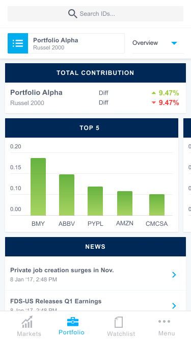
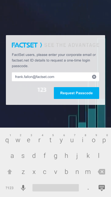
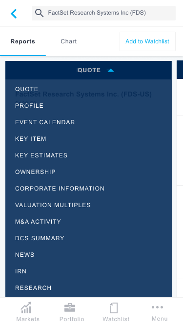
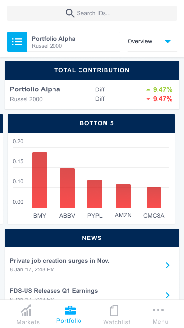
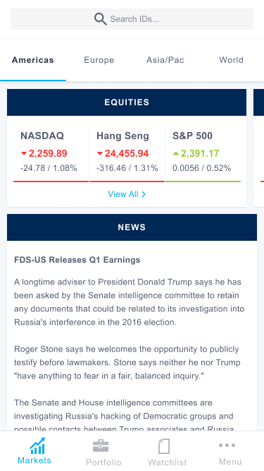
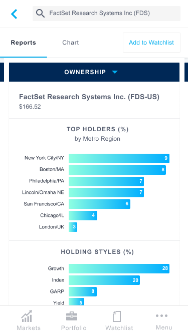
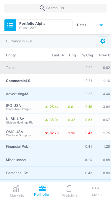

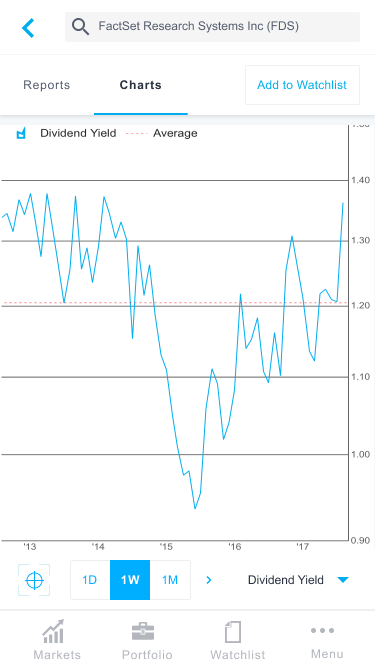
App Store PreviewMy very first project at FactSet Research Systems. Wireframes and visuals were already well underway when I arrived, and the design team was exploring a new visual style - so it was really just a matter of helping refine the ideas and establish consistency in the UI. As new designers joined the team, the limited scope of this application and it's design system made it a great entry point for onboarding and it eventually became the "first project" of all new hires to visual design.
"Leverage the power and intelligence of the FactSet workstation anytime, anywhere. View your latest proprietary security data, monitor real time performance, generate investment ideas and never miss a beat while you're on the go."
This app was designed using Sketch - the teams first departure from the dated Fireworks application, and was delivered to the engineering team using Zeplin - the teams first foray into eliminating "redlines" from the designers to-do list.
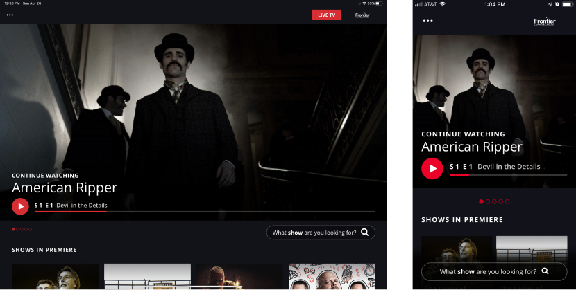
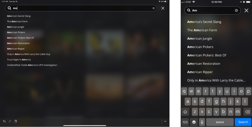
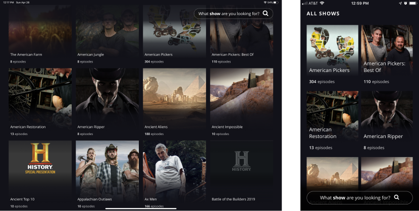
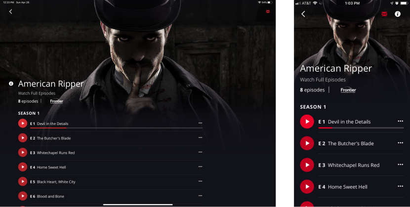
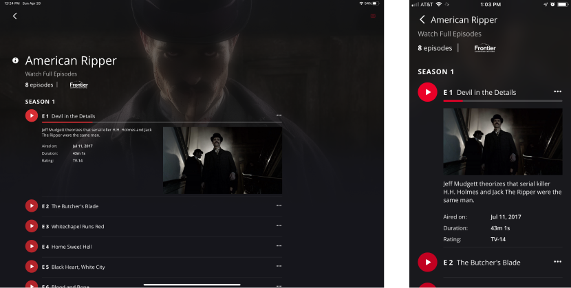
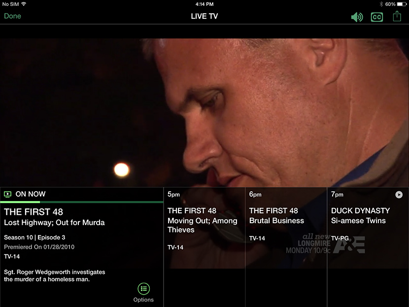
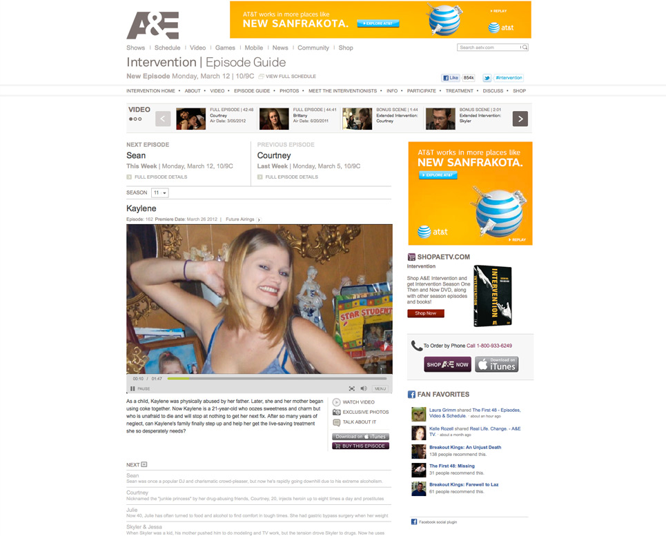
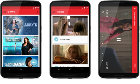
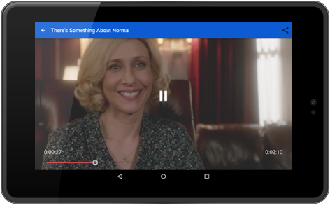
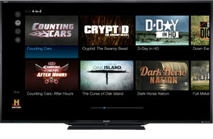
history: tv shows on demand
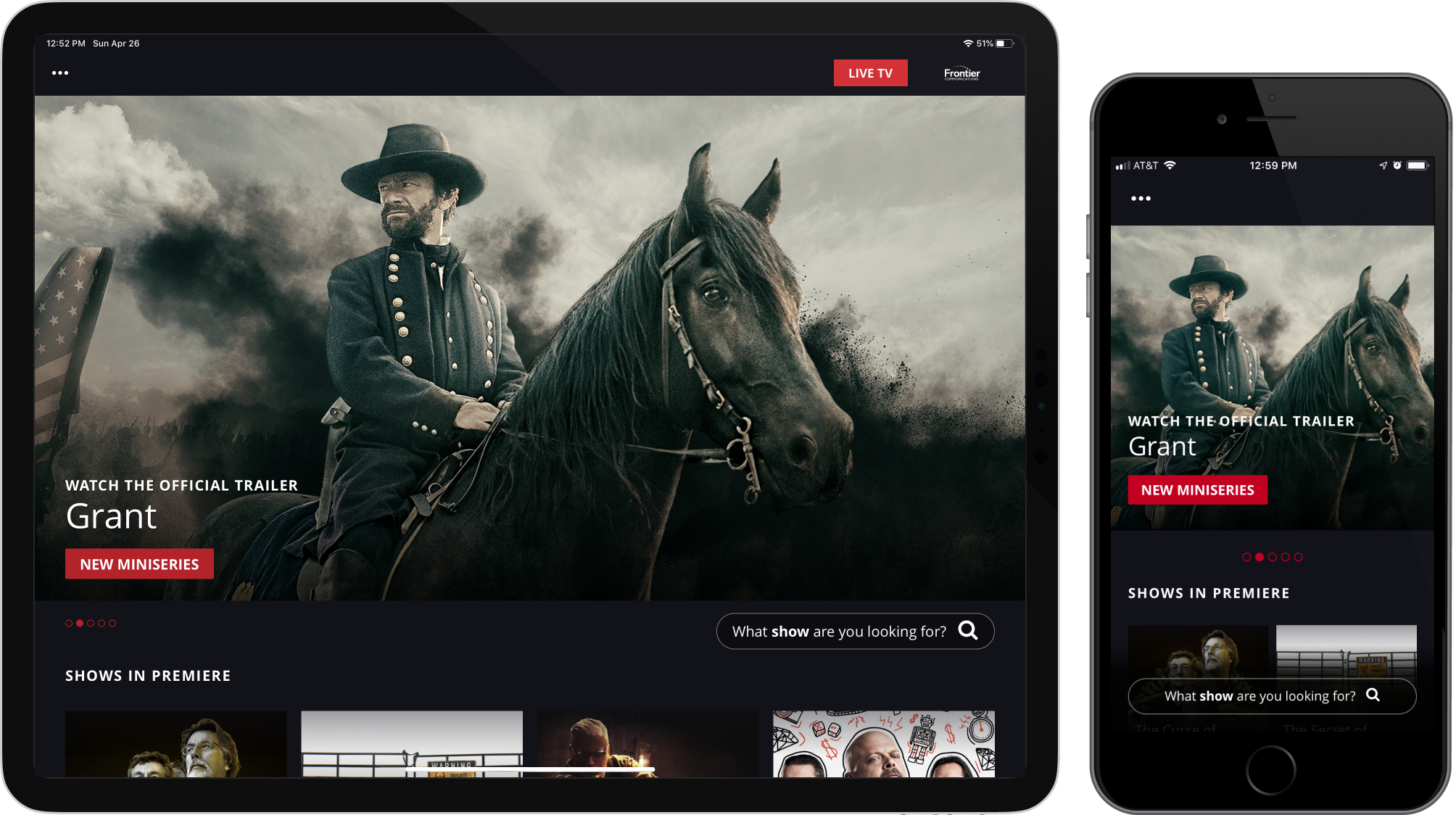
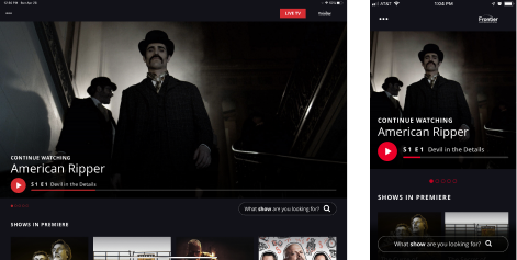
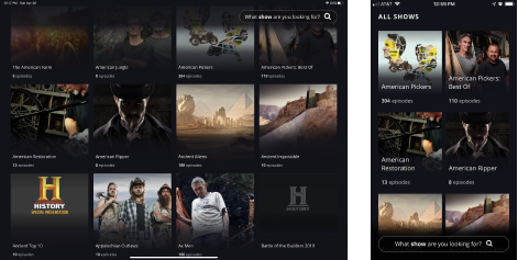
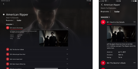
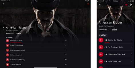
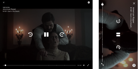
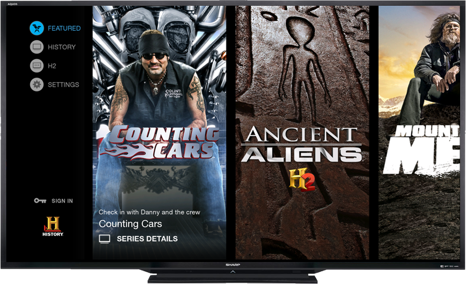
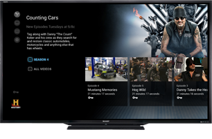
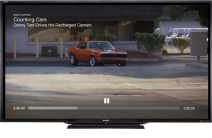
App Store PreviewIn 2015 cord-cutters were in the midst of disrupting the cable industry, and A+E Networks did not want to be left behind in the streaming video wars. A dedicated cross-functional team of product, design, engineering and QA was formed to reinvigorate the companies floundering mobile apps. For the company, this would prove to be a valuable investment, providing a much improved experience for its mobile customers. For me, this would prove to be the journey that helped me learn a user-centered product development process, something which would ultimately shape the future of my career.
“Stream your favorite HISTORY TV shows including The Curse of Oak Island, Ancient Aliens, Forged in Fire, American Pickers & more. Watch full episodes on your favorite iOS device.”
The official role I played on the team was "art director", managing a talented junior designer and a user researcher, as we worked together to create a shared vision. But by partnering with the teams Product Owner and Engineering Lead, I found that I could help shape the future of the product experience in ways which I'd never been able to before.
We were a team new to "Agile" methodologies, and we struggled to adapt at first, as most teams do. The group was comprised of strong individual contributors, but all were far less adept at collaboration. One morning, we found copies of the Jeff Patton book "User Story Mapping" on our desks...and our eyes were opened.
The samples I'm sharing here now are the result of several years worth of hyposthesis, release, feedback loop and iteration and serve the purpose of showing an endpoint. Years since I have moved on from this product, this team and this company, the design solutions we implemented then are still holding strong today. As I have time, I will circle back to this project, adding artifacts from the process, which will hopefully illuminate the journey for you, much the way I experienced it myself.
Download from App Store
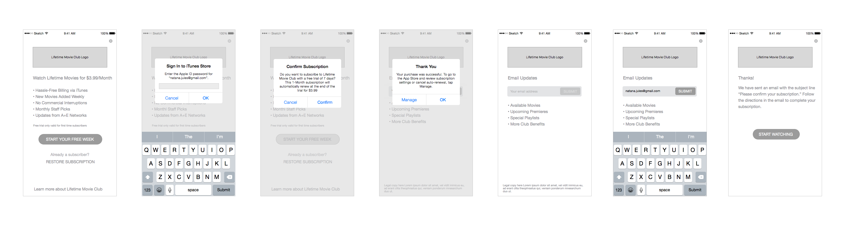
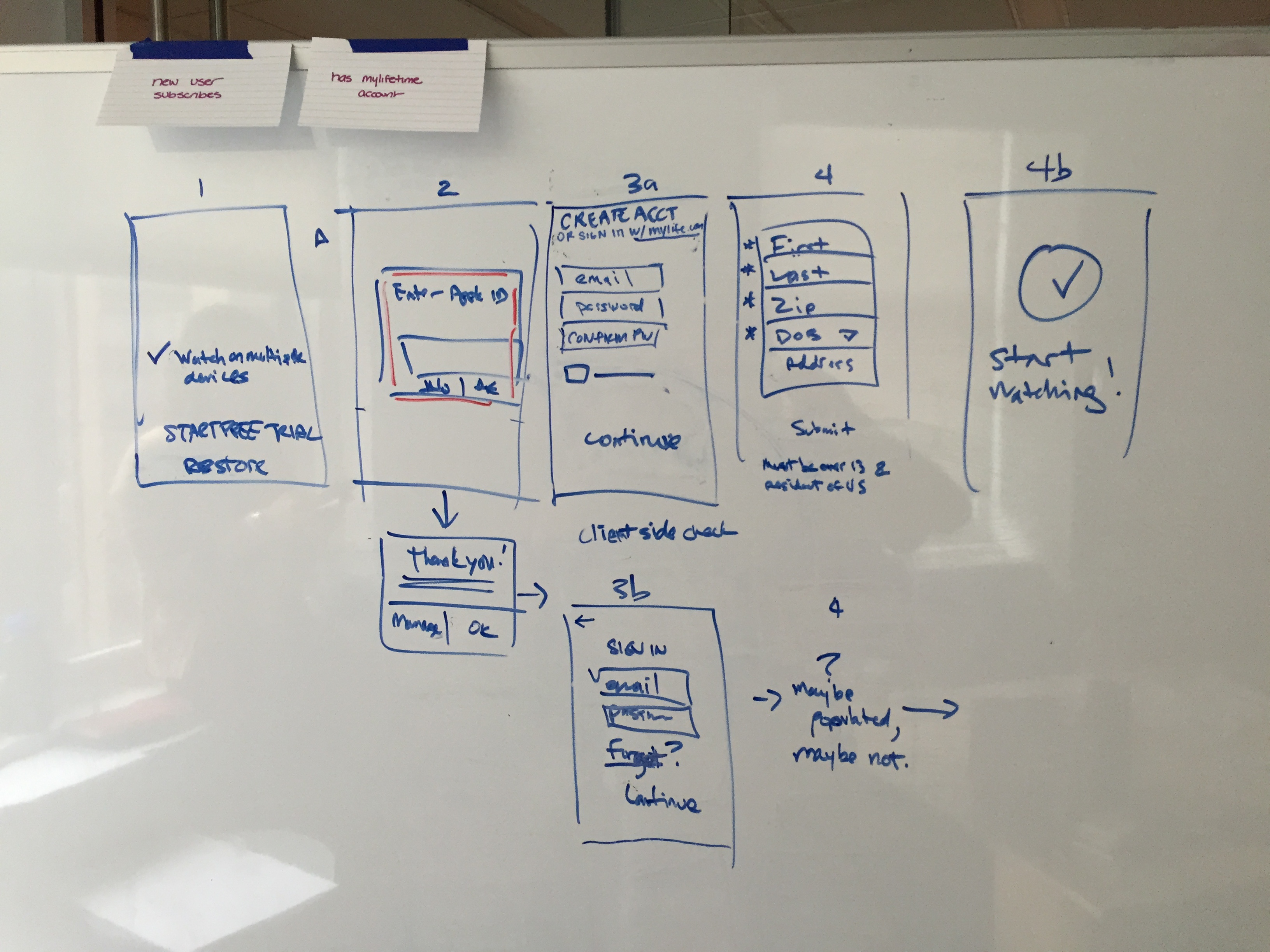
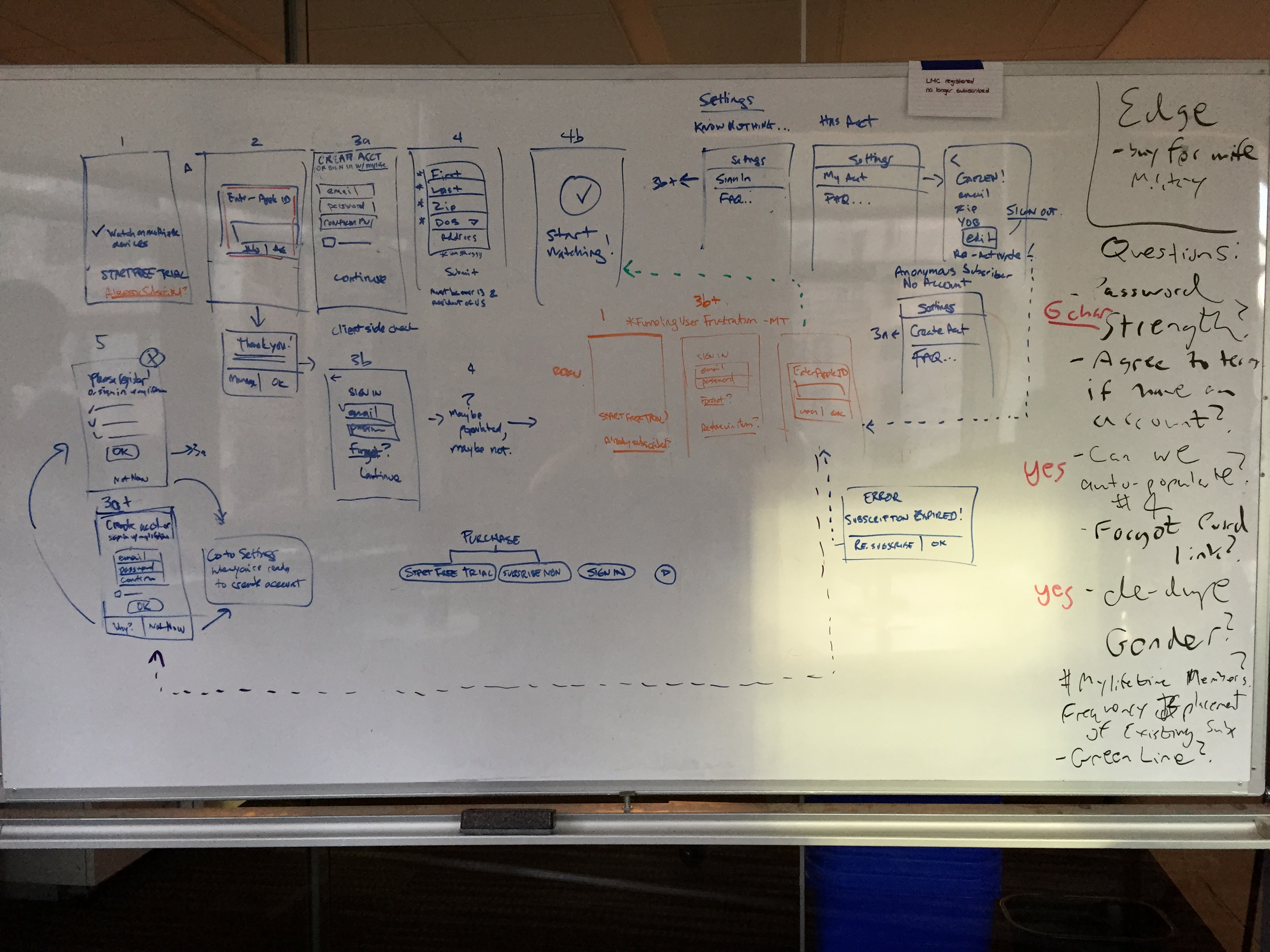
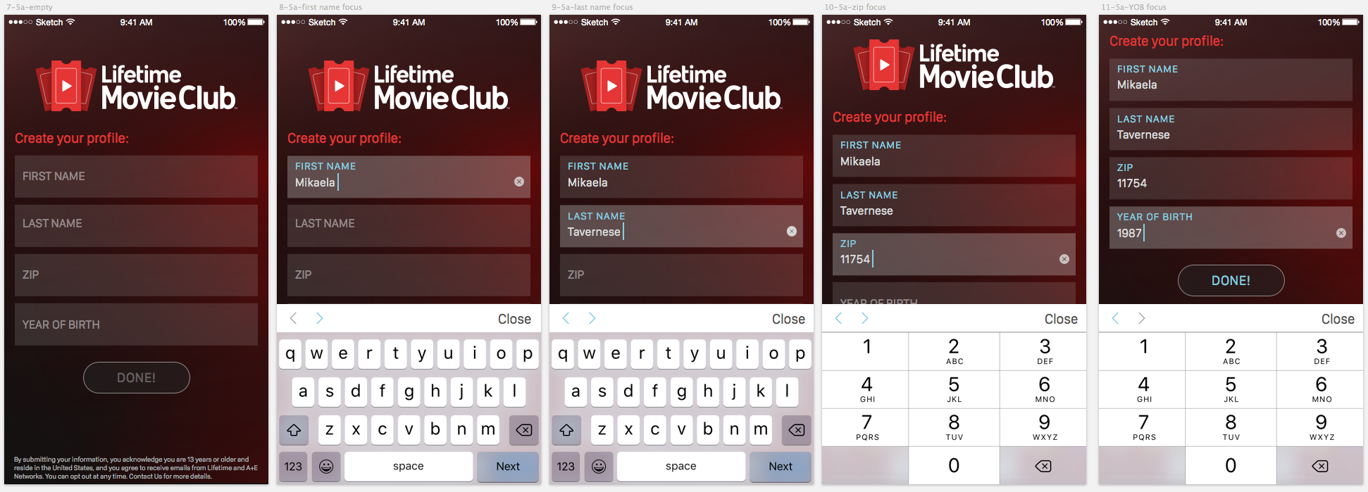
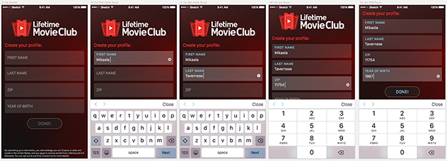
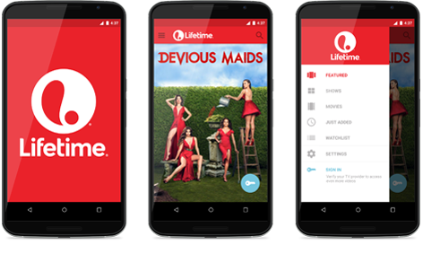
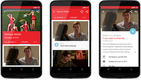
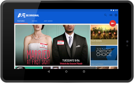
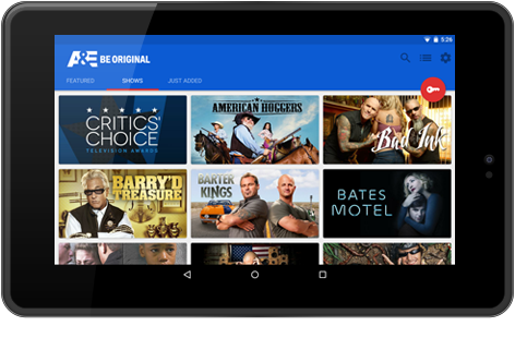
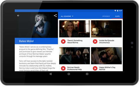
lifetime movie club
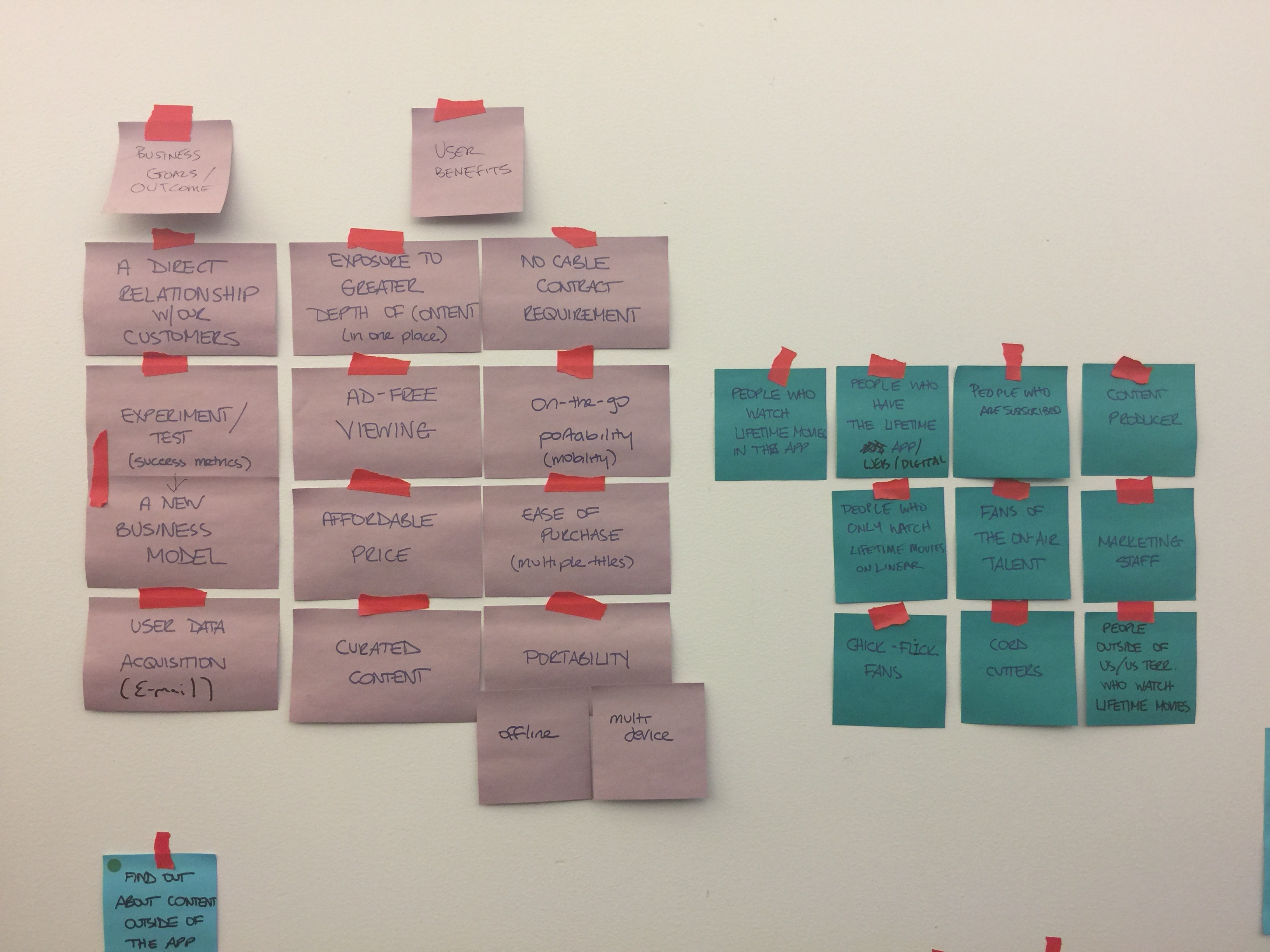
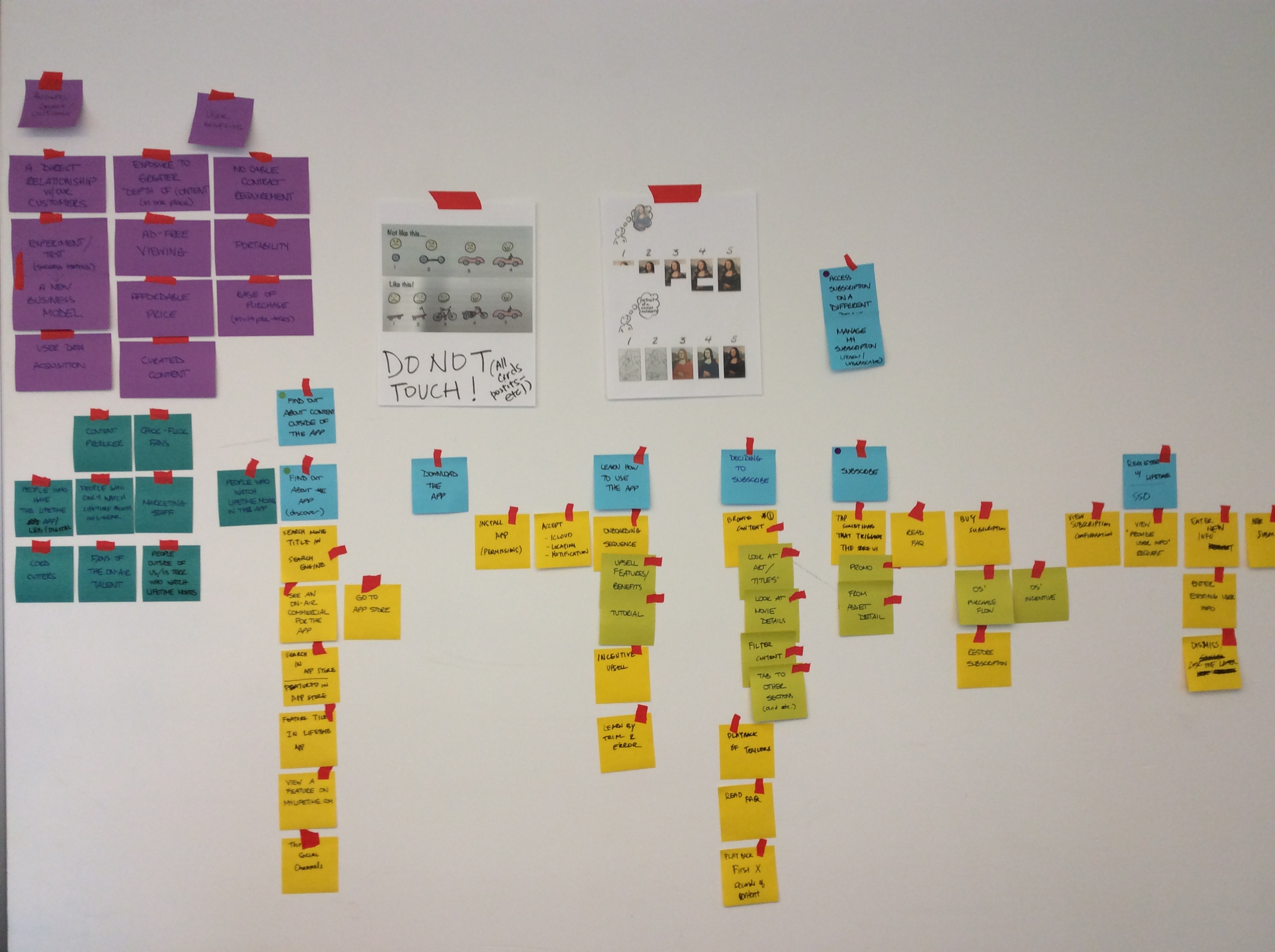
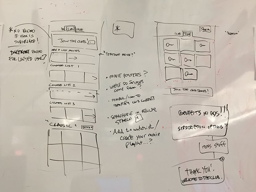
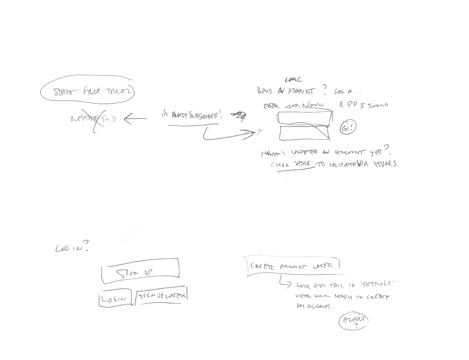
“If you love Lifetime movies, then you need Lifetime Movie Club!” In early 2015, A+E digital began it’s first foray into the subscription video market, with the introduction of the Lifetime Movie Club app, for iOS. Initially viewed as an interesting experiment, it is currently A+E’s highest grossing subscription video app, and paved the way for a new revenue stream for the digital media department.
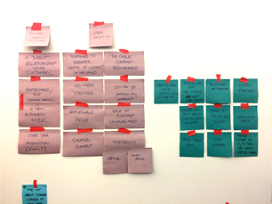
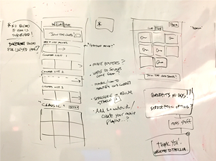
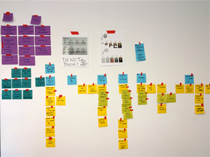
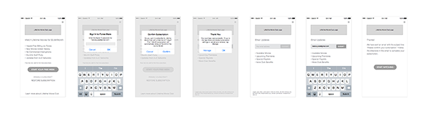
For this project, I took a “hands off” approach to the visual design, giving one of our young talents a chance to take the design lead, and acting in a more supervisory / consultant capacity. At the same time, I worked closely with the product owner and lead ux designer to focus on the roadmap and ux strategy and help build out a more holistic view of the product. Tasks included conducting story mapping sessions and white boarding exercises, diving into the new user flows that the “paid app” model presents, including subscription, email collection and profile creation.As designers, we’re used to showcasing the more “glamorous” side of our work, the final deliverable, as it were, polished and packaged for the masses. Here, alongside the LMC splash animation (the glamorous part), I present a peak into the “hard work” that took place behind the scenes, in order to pull off this successful product launch. Download from App Store
watch app innovation initiative
In order to _____(Vision) our product will solve _____ (Target Audience) problem of _____(User problem) by giving them _____(Strategy) . We will know when our product works when we see ____ (Goal).
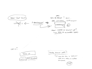
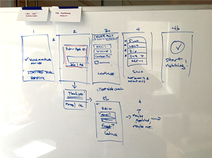
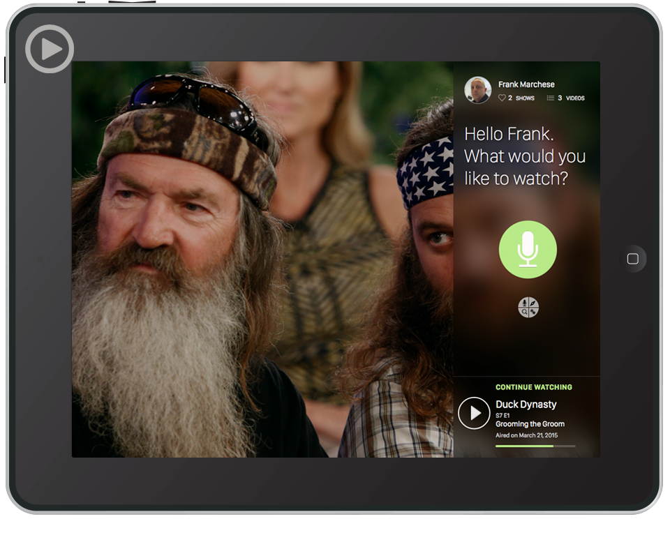
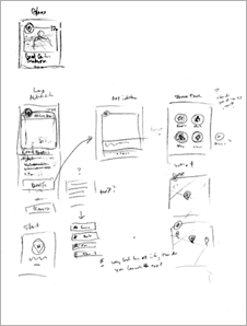
In August of 2015, we began a project I dubbed the “Watch App Innovation Initiative”. Part “team bonding”, part “problem solving” and part “outlet for creative expression”, this served as our first “informal” steps towards rethinking our TV everywhere apps. With one eye on business goals, and the other on user needs, each team member - from design, to dev to QA - was tasked with exploring one idea which could potentially elevate our product to the next level. Deliverables could be in any form, as long as the owner could follow these instructions:"When thinking in products, you should be able to answer the following questions: What problem do we solve? (User problem). For whom are we doing this? (Target audience). Why are we doing this? (Vision). How are we doing this (Strategy) and what do we want to achieve? (Goals). Only then it makes sense to think about what exactly we are doing (Features). Apply the answers to these questions, to the "blanks" above, to form your hypothesis."
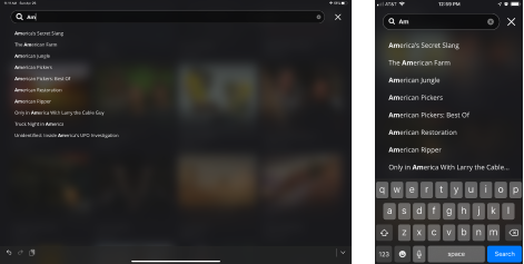
I had several business goals that I wanted to tackle in my exploration, in particular, to increase video views (video starts) and engagement (minutes per user), to improve the overall user experience, and to be a leader in design & technology for TV everywhere. Equally as important, I aimed to address several user needs which we’d identified as opportunities, such as improving the apps search indexing capabilities, creating a more robust search interface, improving the users ability to find specific episodes, and to “decide to watch”.
I had flagged a few guiding principles to myself, such as “Navigation systems are a key way to help guide users towards desirable goals.” and “We should elevate our thinking of navigation and really embrace the influence it has on the experience of using the product we create. It should be among the most critically considered and refined elements in the design.” These tenants seemed to resonate with some of the issues I wanted to design for, and worked in tandem with my desire to strive for simplicity. Here’s what my filled out hypothesis statement looked like:
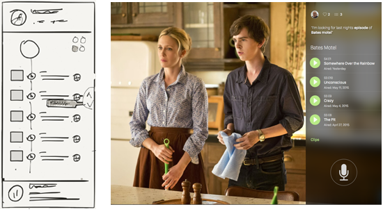
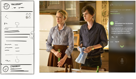
In order to "get the user to what he/she wants", our product will solve "the dedicated fans" problem of "getting to the specific show they are interested in quickly & easily" by giving them "voice search capability". We will know when our product works when we see "users choose this method of navigation above all others".
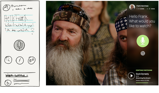
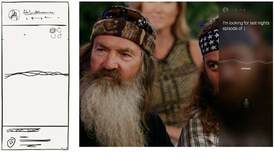
I had several design ideas I wanted to stitch together, and knew that skecthes and flat comps were not going to do the idea justice. For my example, motion would be the key.
“Animation leverages an overlooked dimension — time! An invisible fabric which stitches space together. It seems crazy to me that more people don’t think about interfaces with respect to the dimension of time. Motion can provide so much information!”
And thus, my first stab at inspiriing my team and stakeholders at large was born. Sketches were done on iPad using the Paper app, comps were done in Sketch, and the demo was assembled in Adobe After Effects.
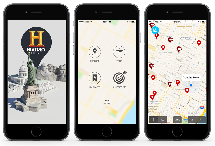
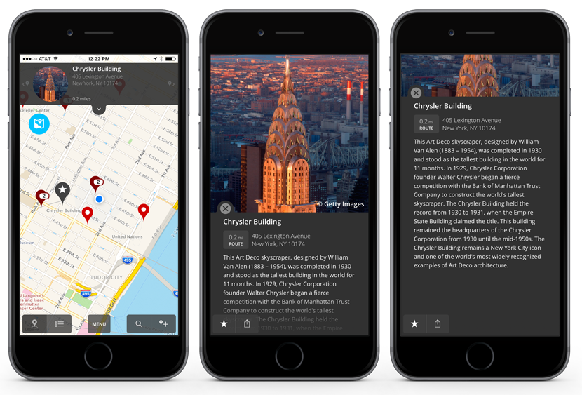
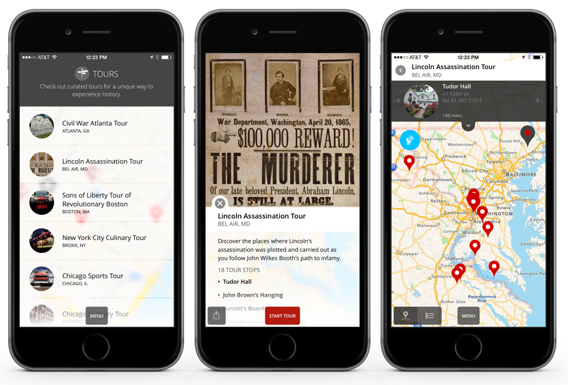
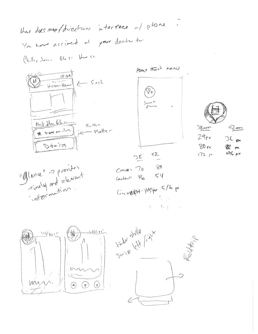
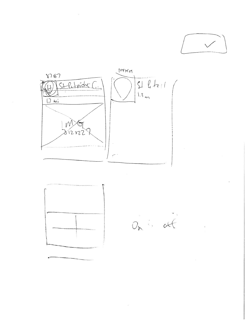
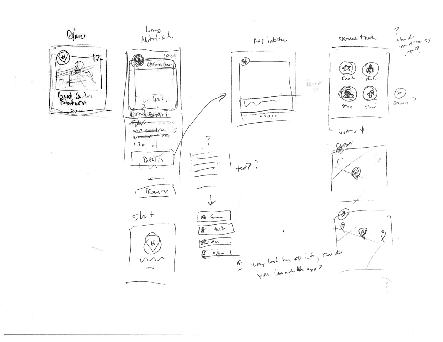
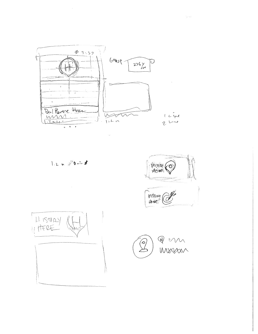
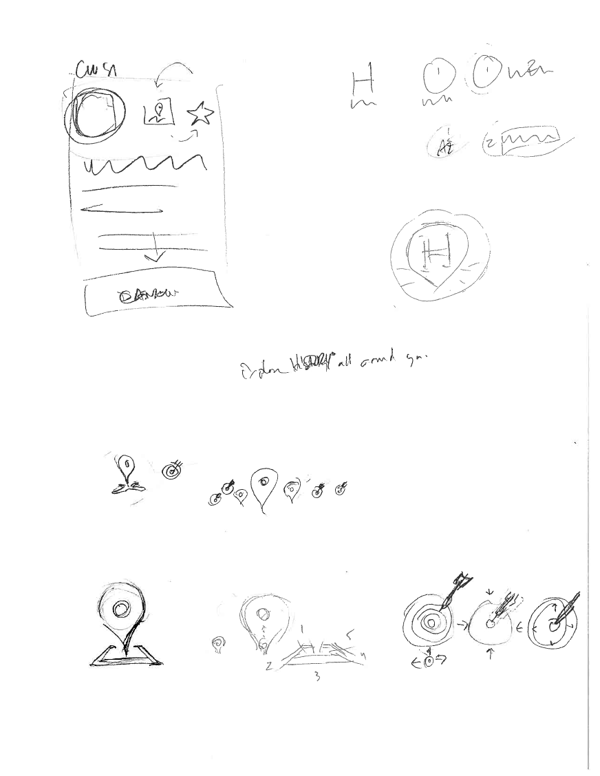
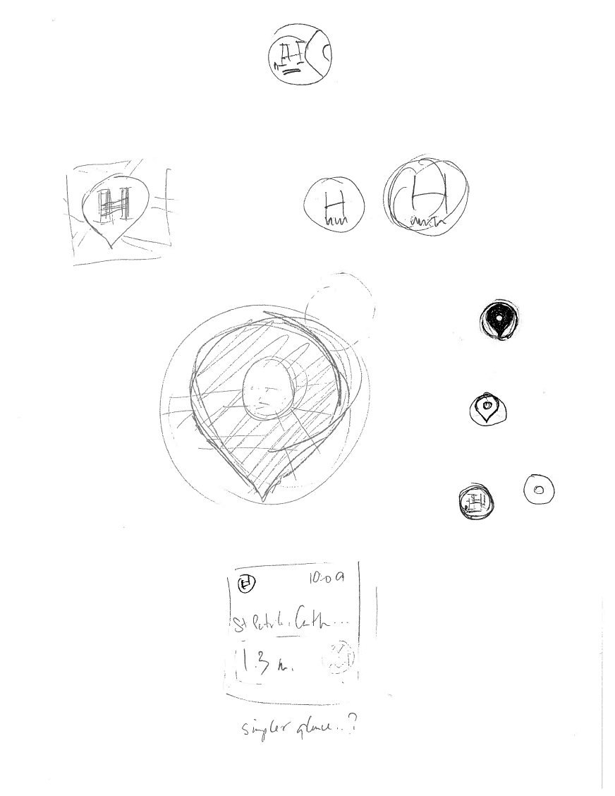
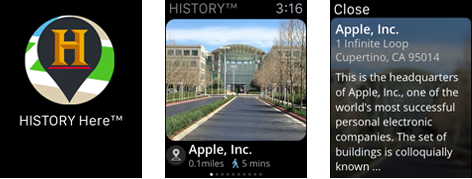
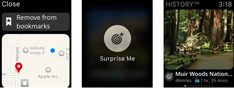
history here for apple watch
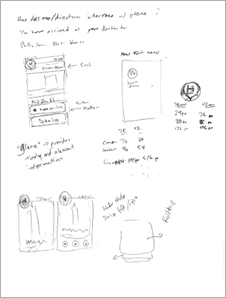
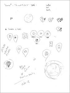
Since the day Time Cook announced the Apple Watch back in September of 2014, all eyes have been focused on the wrist. What started as an offhand remark “It would be cool to do something with the watch”, quickly escalated to “Apple wants us to do something with the watch, think about it over Christmas break.” So post New Year, a small subset of the HISTORY Here™ team set to work in earnest, figuring out exactly what that “watch app” could be.
As Apple was releasing and updating the Watch HIG and developer guidelines, we were downloading ambiguous design templates and ever changing xCode beta’s. We were trying to figure out this new products capabilities, limits, design patterns and styles at the same time that Apple was inventing it. The project culminated in a trip to 1 Infinite Loop, where designer / developer teams had unlimited access to Apple Watch design and development staff - as well as the coveted “Apple Watch” itself - for one week. The app was completed, tested, reviewed, and delivered on the final day of the lab.For this project, I played the role of lead designer and creative director, evaluating and deciding on all UI and UX matters, starting with sketches and evolving to wireframes, before laying out pixels for final designs, and delivering production ready assets. I even took a turn as the “staff photographer”, shooting nearby locations to beef up the HISTORY Here™ photo inventory.
android watch app - material design
Playstore App DescriptionThe “Watch” app collection for the A+E networks has been in the market for several years now, and has registered millions of downloads. However, with Google’s introduction of Material Design and the Lollipop OS, the environment was ripe for a make-over.
“All of your favorite A+E Network shows and movies, available wherever and whenever you want, right on your Android devices. New full episodes and movies, plus behind-the-scenes and preview clips, added every day.”
Google says “Material is the metaphor - grounded in tactile reality, yet technologically advanced and open to imagination and magic. Deliberate color choices, bold, graphic and intentional. Motion provides meaning, serving to focus attention and maintain continuity.” These are the principals which guided this redesign, which is now just weeks away from being in the market.
Inspired by the thought, effort and care put into the new design system, I approached this project as a “what if”. What would our apps look like in this new paradigm? What started out as a handful of sketches evolved into a screen by screen re-examination, until eventually the full system was born out. Once the general layout principles were in place and working cohesively, we then worked through the transitions from one screen to the next, and refined layouts accordingly. Shifting form pencil and paper to the digital realm, we moved to Photoshop and Sketch for the UI design and After Effects and Proto for the motion samples. As the Art Director / Mobile, I led the UI and UX efforts with a small team of design and dev colleagues, succesfully collaborating with the product owner to complete this update to one of our flagship products.
Download from Playstore
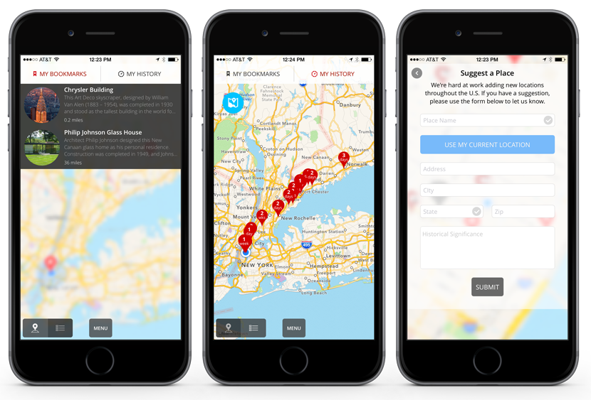
history here
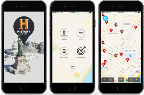
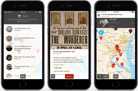
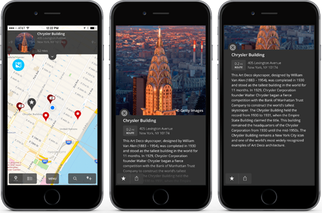
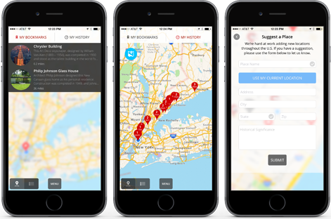
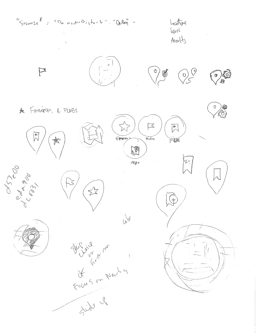
App Mission StatementHISTORY Here officially RE-launched in January 2015 with a brand new interface design, as well as new features such as Tours, Surprise Me! and notifications, which alerts you to and keeps track of historic locations that the app user encounters during their travels. The app has a user rating of 4 1/2 stars in the iTunes app store, and is available on both iOS and Android. Already in 2015, it has won awards for American Mobile (Web & App) Design from Graphic Design USA and for Best Travel app from The Webby Awards.
“HISTORY Here™ is an interactive, location-based guide to thousands of historic locations across the United States, brought to you by HISTORY®. Use the app to learn the history around your neighborhood, when you visit someplace new or if you're just feeling curious while sitting on the couch! Set the app to notify when you're close to historical points of interest and you'll uncover the hidden history that's all around us.”
I was responsible for all UI design and execution, UX strategy and decision making, information architecture and journey mapping, commissioning and directing the creation of artwork, as well as icon creation, nomenclature and branding.
Download the App Tumblr #history here
amazon fire tv (watch app)
"We gave the app a very high-level scrub and had some initial feedback on issues. First blush – love the UI you guys have built out! Takes great advantage of the real estate and really looks unique compared to what is currently on the platform. Well done!"A+E Networks was approached by Amazon early on in the development of this platform, and asked to be a contributor to the product offering. The mobile and emerging media team developed new versions of the History, Lifetime and A&E video apps specifically for the Amazon Fire TV device. Unlike other over-the-top devices (Apple TV, Roku, etc) Amazon left the design parameters wide open, only suggesting some basic UI patterns to follow, but not putting any restrictions on creativity. As you can see above - they were impressed with the results.
John Jordan, Amazon Business Development
In collaboration with the product stakeholders and the Android product development team, I lead the UI and UX design for this project from initial concept to product launch in the app store for Android. Concept sketching, wireframing, storyboards, user flow, interaction design, screen designs and layouts, iconography, animation and transition samples, production specs, QA and UAT.
Download from Amazon Tumblr #amazon fire tv
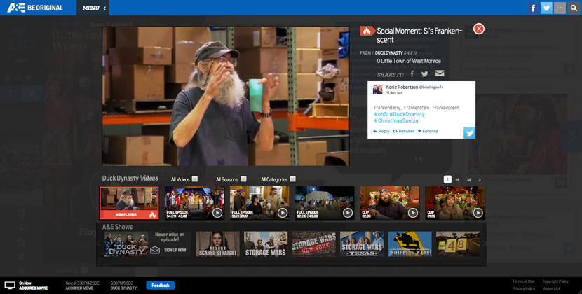
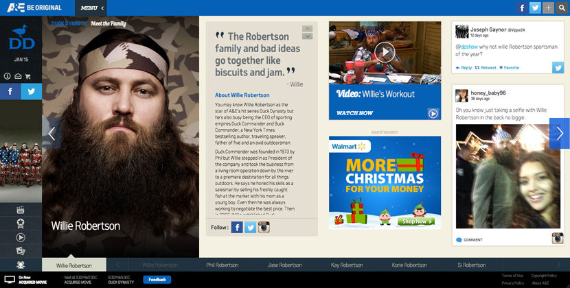
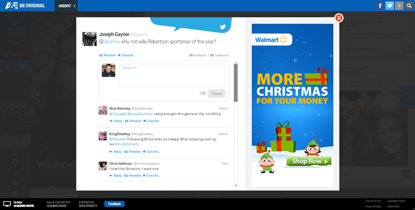
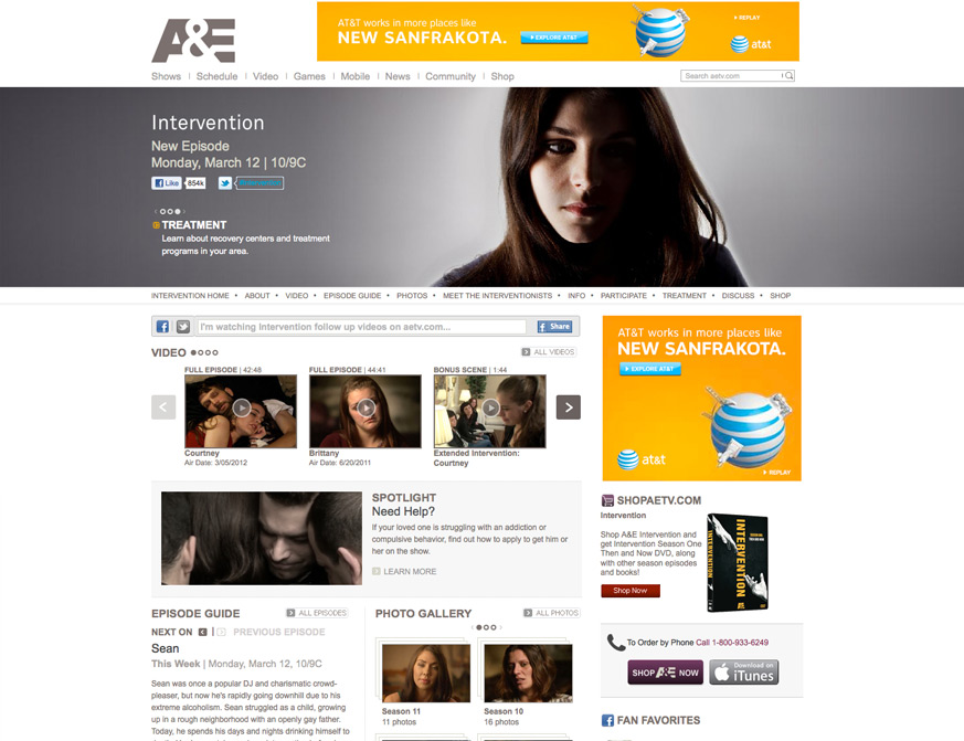
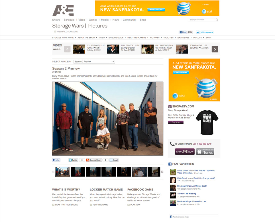
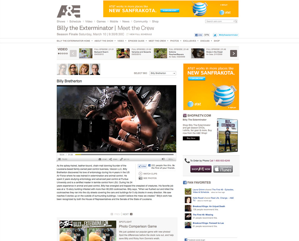
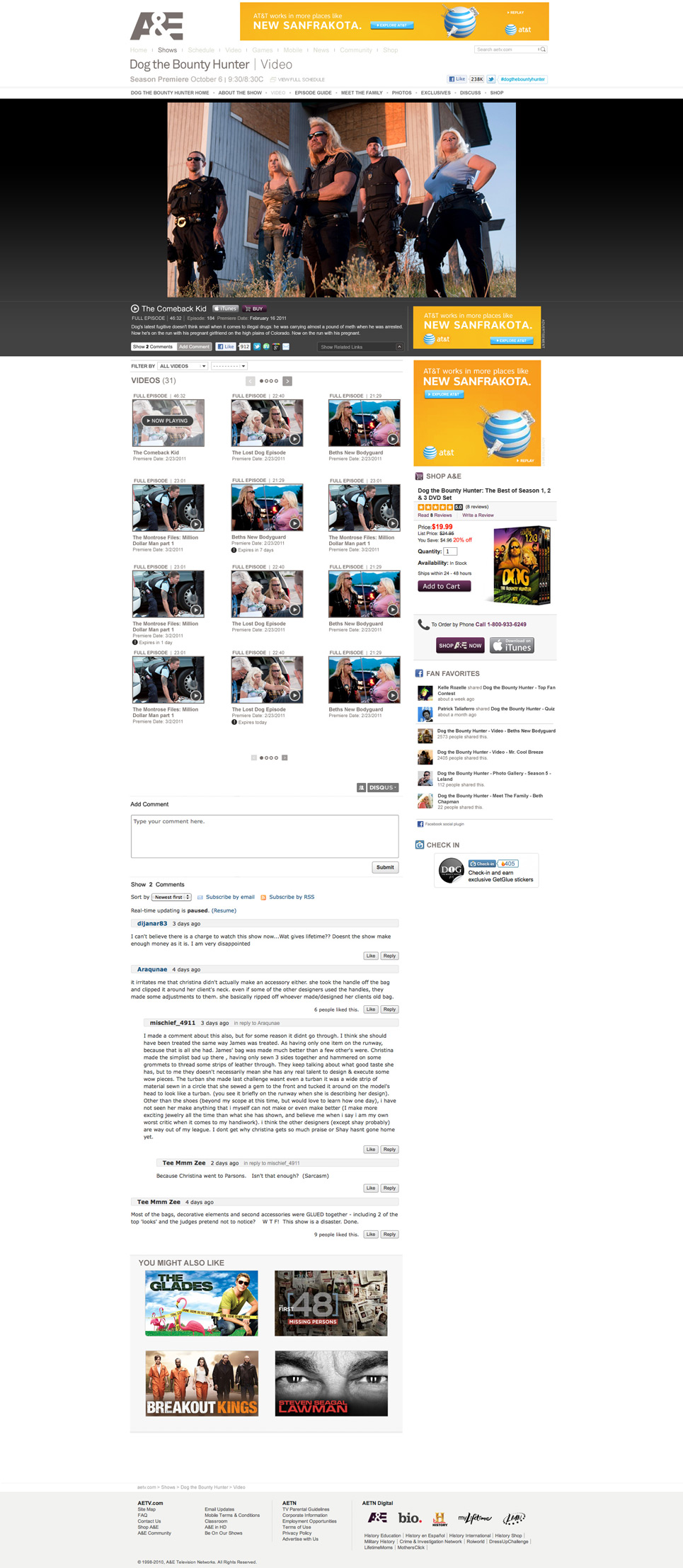
aetv.com (2014)
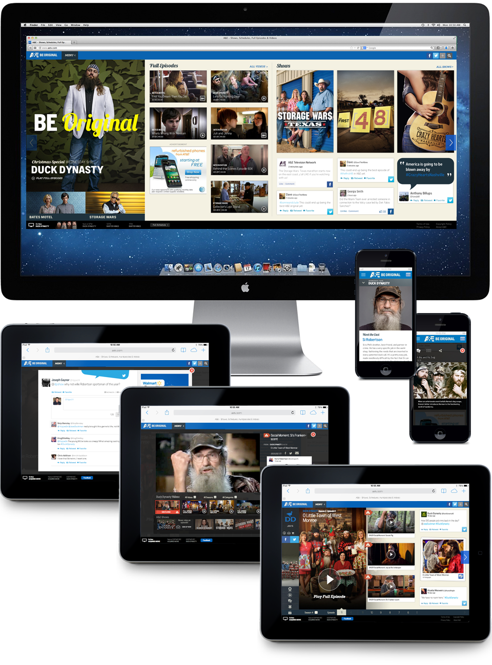
What if you were asked to take the traditional television network web site, and turn it into something new? What if you could start over, using the web site less as a promotional vehicle for linear tune-in, but as the means to define a social tv experience? How would you do this?
- Expose the conversation taking place - at all of the major social media touch points - about the series, about the characters and about each episode.
- Create a unique way for the A&E audience to see this conversation and interact with it, as part of a "social tv" community.
- Go beyond merely surfacing the wealth of social media content being generated, but use it to build out the "story" of every episode, every character and every water-cooler "moment".
- Use the buzz of the social tv audience to help define "moments" - bite-size video segments, easily shared across multiple social networks - engaging at multiple touch points to watch, react and share again - extending the reach to those outside the A&E community - and returning an even wider audience to the A&E web site.
- Be groundbreaking.
- Be buzz worthy.
- Be original.
I was part of the core team who lead the project from inception to completion. I participated in vendor evaluation and selection, defined the scope of and strategy behind the project, analyzed and refined the user experience proposal, worked cross-department to insure that all understood and agreed to new methods and processes required to produce the site, cemented the creative vision, lead the UI & UX design team (including all wireframes, comps and prototypes), collaborated on functional spec and front-end development, performed QA testing and lead production through site launch.
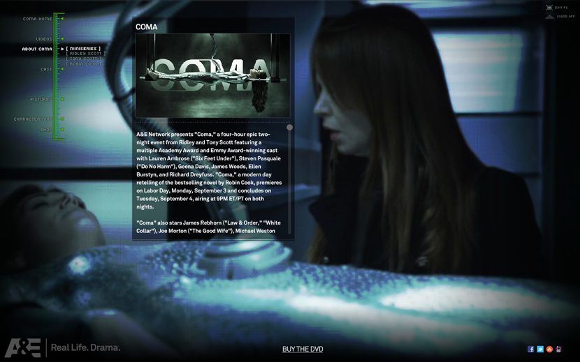
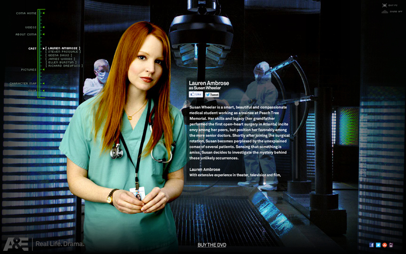
coma
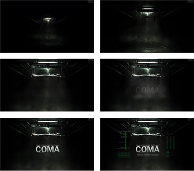
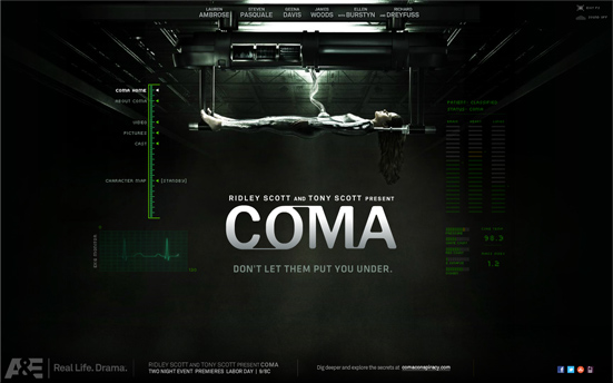
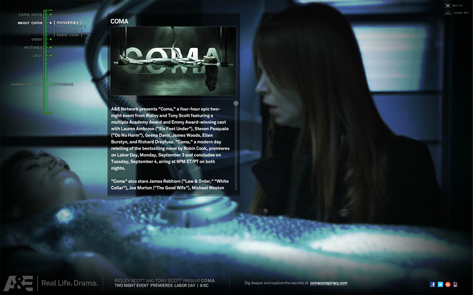
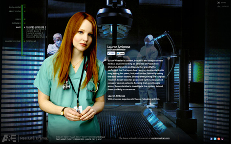
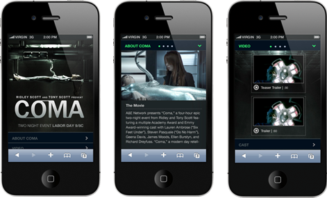
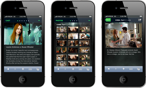
“A&E Network presents "Coma" - a thriller about a young medical student (Lauren Ambrose) who discovers that something sinister is going on in her hospital after routine procedures send more than a few seemingly healthy patients into comas on the operating table. The four-hour epic two-night event is produced by Sony Pictures Television for A&E Network, with executive producers Ridley and Tony Scott.”Having developed a succesful site model with the mini-series Bag of Bones, the design team had a relatively easy time adapting the skin for the series COMA. This time, however, we also developed an iOS mobile version, specifically for the iPhone and iPad audience. The roadmap to completion on this one was a bit more challenging, but in the end, the web app version of the COMA site will lay the groundwork for future A&E mobile developments.
Took the reigns on all page layouts and visuals, interaction design, transition concepts and prototypes. Creative direction for both Flash and iOS builds.
Launch COMA website u: stagingae | p: in4me
aetv.com motion graphics

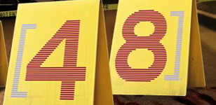


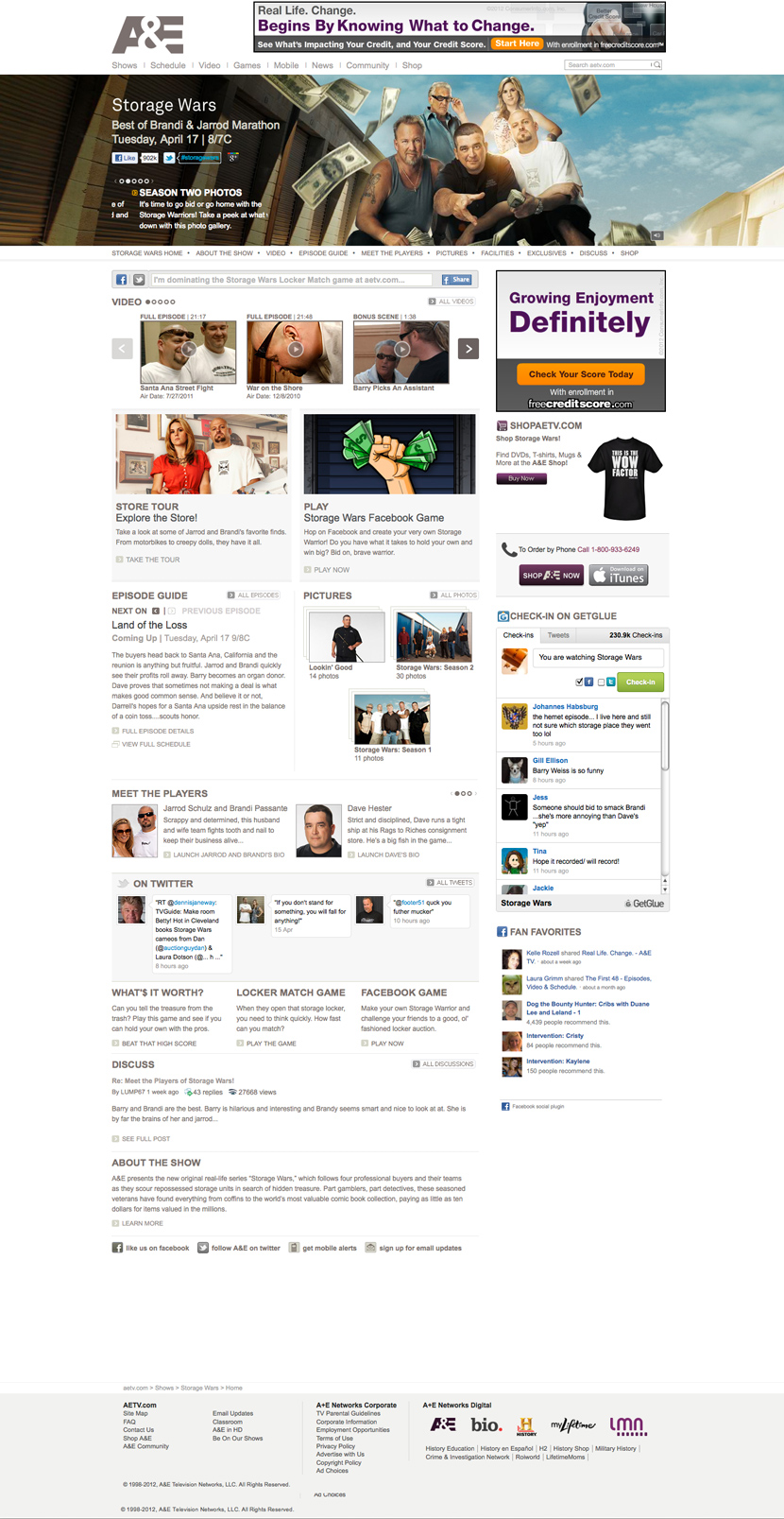
Storage Wars. The Glades. Dog The Bounty Hunter. The First 48. A&E network has been known for it’s diversity of genres, and unique story telling.
For years, the sites which we created for every A&E show were used as a vehicle to promote tune-in and reinforce the visuals of that seasons marketing campaign. Leading a skilled and talented team of designers, animators and sound engineers, we took every opportunity to add the story telling element to our web pages, bringing the “static” art created for posters and billboards to life for our web audience.
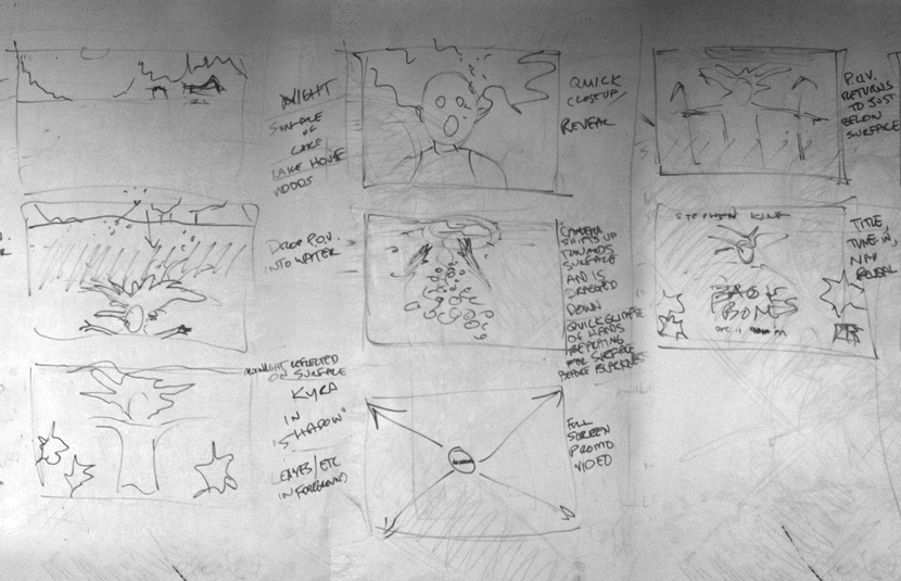
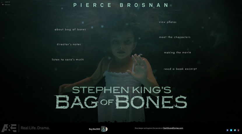
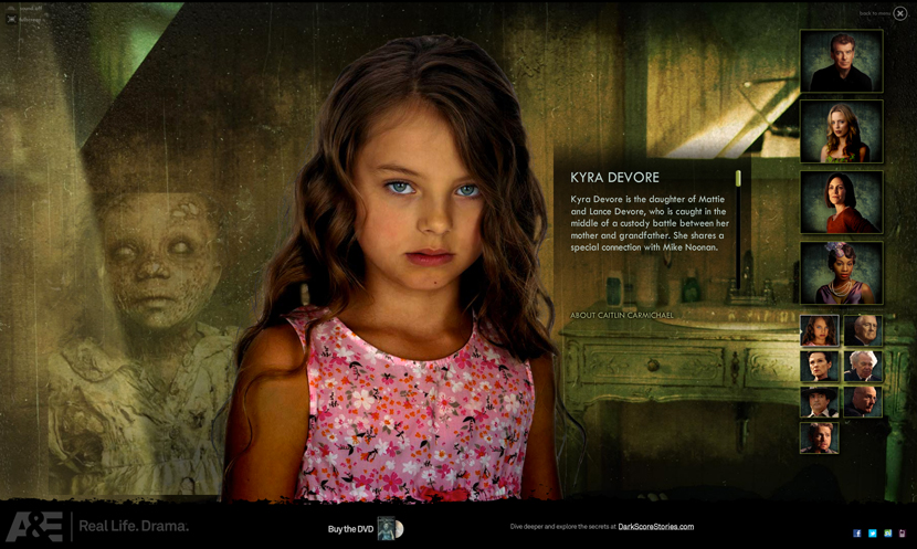
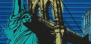
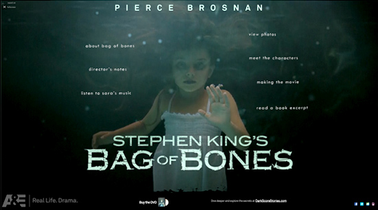
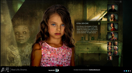
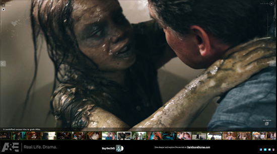
stephen king's bag of bones

"Wide angles and skewed perspectives will always give a hint to an unknown observer’s point-of-view, and a sense of something, especially of a haunted nature, lurking in the soft focus and shadows."
Mick Garris, Director & EP, Stephen King’s Bag of Bones
Breaking out of the typical A&E show template, the digital design team flexed its creative muscle and delivered a new type of experience for our user. Richer, deeper, more cinematic, with an eerie, haunting audio track and video transitions throughout, we pitched the concept to A&E’s senior marketing execeutive, and he was quickly on board.
Coordinated and directed the talents of a strong internal design team, including interface design in Photoshop, audio engineering, video editing and compositing in Garageband, Final Cut and After Effects, and interaction development in Flash. The result syncs perfectly with the vision of the Bag of Bones director and captures the haunting spirit of Stephen King’s work.
Visit Bag of Bones Tumblr #Bag of Bones
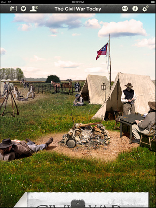
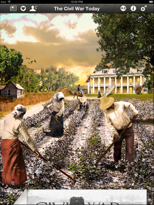
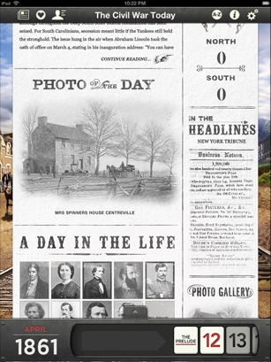
the civil war today
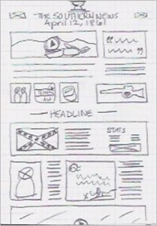
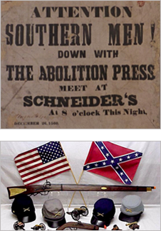
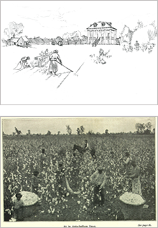
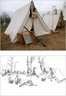
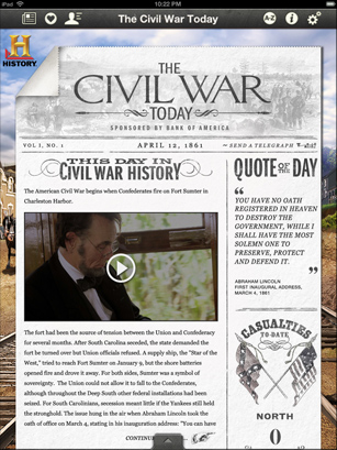
App Mission Statement
“To serially chronicle American life during the United States Civil War (from the events leading up to the attack on Ft. Sumter to the final battles in disputed locations spanning land and sea) using modern technologies. And to bring to life the events (from 1861 to 1865) that so deeply affect every American - past and present - so that anyone, with any interest level in to the topic, finds themselves focused, engaged and even engrossed in the stories of the most deadly war in United States history.”
A&E Mobile partnered with premium app vendor BottleRocket on its first major iPad app undertaking for the History Channel brand, The Civil War Today. Each day, iPad users are greeted with an update detailing the battles and historic information from that date 150 years earlier. These details are presented interactively using photos, maps, newspaper clippings, diary entries and more.
Participated in vendor selection, analysis and feedback on user experience proposal, helped define the audience, overall direction of UI design, broadsheet layout and typography, provided creative direction, written descriptions and visual samples for location illustrations.
The Civil War Today was subsequently named Apple’s iPad App of the Year (2011) in the Entertainment category.
Download the App
missing in the glades: the hunt for jim longworth
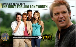
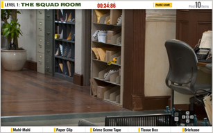
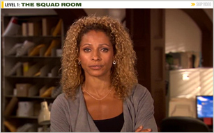
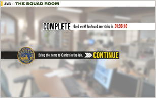

What if we took a simple, casual game and wove a story around it which would integrate the cast of the popular A&E drama The Glades? It was a simple idea, helped turn reality by developing a strong core concept, backing it with flawless game play functionality and top-notch graphics - which in turn gave the five major cast members cause to embrace their alter-egos and turn in great on-camera performances to give our piece just the finishing touch it required. The result? One of aetv.com's most popular and most played games ever.
Creative direction provided to editorial and design team for concept and story development, on-location photo shoots, Photoshop image compositing and Flash interaction design.
My strengths:
- Providing creative leadership and/or hands-on design for projects across all digital platforms;
- Designing unique, creative, user-centered interactive solutions (UI AND UX);
- Conceptual and strategic thinking (IA);
- Understanding overall business, brand and marketing objectives;
- Effectively presenting and communicating solutions to team members, clients and stakeholders;
- Collaboratively establishing goals, objectives and best-practices;
- Building and cultivating digital product identity;
- Technical and conceptual problem solving;
- Scoping and anticipating client needs and project criteria including writing functional spec documentation;
- Organization, time management and proper resource allocation based on project timelines;
- Coordinating and managing projects, managing and mentoring project teams;
- Establishing and maintaining high quality standards;
- Driving an experience from initial concept to final execution.